Rainbow Connection: Another Color Palettes Resource

From the Big Fat Indian Wedding blog comes a terrific color palette resource, Color Palette Monday. Artists seeking inspiration and new colors to try in their designs should definitely check it out.

Share this:

Tips and Tricks: Changing Old Designs

Quite often, when we first start designing greeting cards, we don’t know what we’re doing. We try things. We experiment. We create more from the heart than the head. Sometimes, that totally works and you get a classic card straight out of the gate. Other times, not so much.
We know GCU is slowly but surely weeding through older cards and applying their (relatively) new standards. Cards that no longer fit the bill will be declined. But we say, why wait? Surely you know that by going through older cards yourself, tweaking here, making changes there, using a more critical eye, can only increase your chances of making a sale, especially since you’ve got experience under your belt and can apply the new standards yourself.
Here’s an example of why we should be weeding our old cards:
Alda Monteschio received the following message from an unhappy customer –
“I purchased product # 193559 ‘My Heartfelt Prayers’. I loved the sentiment of the words but the printing was way too light in color. On the front of the card the words got lost in the vines & foliage. Inside card words are printed way too small. As I stated, I loved the sentiment, but was unable to use this card because of the printing. Was disappointed. Had to go out to a store and purchase a card.”
The card looked like this:
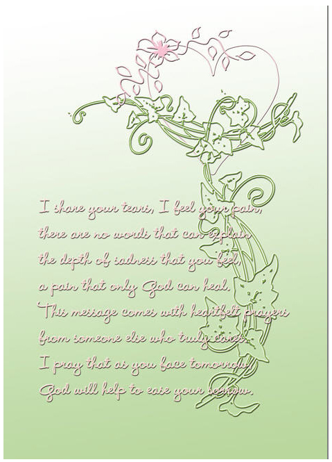
This was one of the first designs Alda made for GCU and she’d sold quite a number of them over time. Now being aware of the printing problem (there’s just not enough contrast between the background color and the text color), she quickly revised and updated the design. Here’s the new version:

Much better and a heck of a lot more readable! We’re sure Alda will continue selling this popular card.
When I worked in customer service many years ago, we were taught something that has stuck with me all these years. “For every customer who complains, there are nine others who don’t say a word and just take their business somewhere else.”
Do go back and take a look at older designs. Apply the new standards. Be self critical. By now, you should know if something will print well or not, or if a design has run over the margins, or if the composition is off. Freshen up your cards, do a little spring cleaning, and your sales will soar!
Share this:

Design Contest: Pot O’ Gold


Inside: A leprechaun just farted! Happy St. Patrick’s Day!
Top o’ the mornin’ to ya! It’s time for a new Design Contest: Pot O’ Gold, and as you’ve probably guessed, we’re having a St Patrick’s Day theme!
To enter the contest, simply add a comment to this post with a link to your St Patrick’s Day card at GCU. Deadline for submissions is February 26. Voting will open on February 27. The artist who receives the most votes will win a prize – $10 Amazon.com gift certificate or 5 free card credits. Bonuses are available – see below.
Good luck to you all!
Bonus Votes
Five (5) bonus votes for nominating another artist’s card as well as your own (should either of you win, both of you will receive a prize).
Lucky four (4) bonus votes if your card has a leprechaun and/or pot of gold design.
Five (5) bonus votes if you pin five (5) GCU cards with a St. Patrick’s Day theme to a board on Pinterest (leave a link in your comment).
Five (5) bonus votes if you blog or otherwise promote St. Patrick’s Day cards on GCU on a website (leave a link in your comment)
Share this:

Dash of Inspiration: Diaries of a Fontaholic, Part 3
A Dash of Inspiration, A Cup of Creativity by Doreen
Diaries of a Fontaholic, Part 3

Welcome to the third installment of ‘Diaries of a Fontaholic’. I decided that it was better to split today’s segment into two weeks, so next week will be the final installment where I’ll share some font tips that can make the difference between a professional greeting card, and a greeting card which looks amateurish … based solely on your choice of font and placement.
Today, in Part-3, I’ll be introducing you to my Favorite ‘Specialty-Use’ fonts. These include elegant fonts for Weddings, fun fonts for Christmas, Halloween and Kids; as well as some Western favorites.
So here we go …
Same as previous weeks, to make things a bit easier for our dear Corrie who actually does the official posting on the blog, I’ve tried to group the fonts, therefore offering fewer links. All you need to do is copy the font name and paste it into the search feature on the home page of the links provided in the groupings. When the font name shows up, click on that and you will be taken to the download page for that font, where it also show the license.

Elegant Wedding Fonts: You’ll find that as a general rule of thumb, most elegant ‘wedding’ fonts which are legible and therefore used in the professional designer ring, require a purchase. Most of the free fancy script fonts you’ll find, become illegible when used on greeting cards. These are my favorites and CAC Champagne is FREE.
Old Fashion Script™
Bickham Script Complete Family Pack (the most expensive font family I’ve ever purchased, but well worth it)
These 2 fonts can purchased here
Flemish Script
Diplomat
Vivaldi
These 3 fonts can be purchased here
CAC Champagne
Can be downloaded for free from Font Squirrel
Christmas and Halloween Fonts: For those lighthearted and cheerful Holiday cards, I like a fun and festive font. Halloween fonts are difficult because though we often think the eerie fonts are cool for the season, most are difficult to read and therefore not a good choice. Over the years, I’ve found these fonts to be seasonal favorites of mine.
Snidely Font Family
Shlop Font Family
Riky Vampdator Normal Font
These 3 fonts can all be downloaded for free from 1001 Fonts
Mountains of Christmas
Nosifer Caps
These 2 fonts can all be downloaded for free from Font Space
ActionIs
Fontdiner Swanky
These 2 fonts can all be downloaded for free from Font Space
Western Fonts are great for anyone who works with western-style images. These are my favorites because they maintain the western theme while remaining legible, often a common problem with special-use fonts. Edmunds is free, the other two very reasonable.
Giddyup Std Regular
Saloon Girl
These 2 fonts can all be purchased from MyFonts
Kids Fonts I offer my favorite fonts to use when making cards for children. I like to keep a ‘child-like’ feeling to the text, kids relate to that better, but again there are so many fonts like these out there which just don’t maintain legibility and therefore you lost that ‘professional touch’. These are my favorites for various uses.
Eraser Font – I only use this font on chalkboard/school imagery, so keep in mind that if used outside of it’s ‘design use’, it will most likely be considered inappropriate and/or excessive.
GoodDog
Learning Curve Pro
These 3 fonts can all be downloaded for FREE from FontSquirrel
SpacePatrol Font – I find this font to be fun for boys, especially when combined with space and alien imagery.

This an example of Eraser Font in use on a chalkboard.
Hope you enjoyed this installment of Diaries of a Fontaholic … See you next week for the final installment where I’ll offer some great Font Tips to keep your designs professional!
Share this:

Critique Clinic – February 15-17, 2013

How does it work? For three days a week (Friday-Sunday midnight), I will open the clinic to any artist who wants an honest peer review and critique of a card which gets plenty of clicks but no sales, so something’s probably not quite right, or you’ve got a new design you want to test drive, or you’re unsure about the marketability of a card. Or perhaps you’re a newbie who isn’t sure if a card is up to a marketable standard. Anyone is welcome to participate. In fact, I encourage everyone to at least look at the cards in question and read the critique comments – you may learn something. The purpose of the clinic is to help artists improve the commercial appeal and marketability of their cards.
THE RULES
- ONE card per artist only.
- Card must be intended for sale at Greeting Card Universe.
- To submit a card for critique, post a link to the card at GCU in the comments section of this clinic post. Allowances will be made if you’ve had a card declined, or made a new design you’d like advice on before submission. Give us the link where we can see the card, such as your private gallery, Flickr, Tinypic, etc. If you do give a private gallery link, be sure your private module gallery is ON. Please do not post links to your Manage Cards section – do you really want strangers tinkering with your cards? And please don’t ask us to critique a card that’s pending review – we can’t see it until it’s approved.
- Any artist is free to comment and/or give a critique of a submitted card. HOWEVER, post-and-run comments like “great card” or “you suck” will not be tolerated, nor will abuse. Criticism should be constructive, not destructive. Play nice or you will be banned.
- I also won’t tolerate temper tantrums if you decide your “artistic integrity” is being stepped on because you asked for a critique, and someone told you the photo you’re using isn’t in focus. If you can’t take honest criticism, don’t submit. Once gets you a warning; twice and you’re banned from submitting in the future.
- Artists who critique may do so by giving their opinion, posting an example of another card, or pointing the submitter to a video, on-line article, or other helpful suggestion.
- Don’t forget that artists who are giving you tips and helpful advice are volunteering their time and trouble. Be nice. A link back to their store on your website or blog is appreciated (but not mandatory).
- You are free not to take any advice offered. There’s no guarantee any card will be a bestseller, so don’t come into the clinic with unrealistic expectations.
- Rules may change as we go along and we see how things turn out, okay?
So without any further ado, I declare this week’s Critique Clinic open!
Share this:

Happy Valentine’s Day!

Wishing everyone a Happy Valentine’s Day with the love monkey of their choice!
Share this:

Rainbow Connection: Another Color Palette Resource
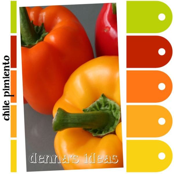
Today we’re bringing you news of a terrific color palette resource on Denna’s Ideas. Many of the color schemes are vibrant and bright, perfect for designing cards that pop! Take a look and have fun!
Share this:

Design Spotlight: Gail Pepin

Today’s Design Spotlight shines on Gail Pepin, an artist whose designs exemplify the term “marketable.” She works hard, we love her cards, and know you do too!
_________________________

The card I chose is a birthday card featuring aliens. Although I’ve only sold a few, I remember having so much fun designing this card, that it’s one of my favorites. I let my “inner child” take over in the design.
I’ve been an artist for many years and live in Colorado Springs, Colorado. I worked in marketing, taught for a while, and am currently freelancing. I use Adobe Illustrator and Photoshop for my cards.
I have a variety of art styles going on in my cards, because I’m always trying new things. I love to experiment. I started out in fine art and learned computer art while working. I also do pottery and am enjoying throwing teapots right now.
I’m happiest when I’m creating something and designing cards is like “play time” for me. My goal is to bring joy to people through my cards.
Share this:

Dash of Inspiration: Diaries of a Fontaholic, Part 2
A Dash of Inspiration, A Cup of Creativity by Doreen
Diaries of a Fontaholic, Part 2
Welcome to ‘Diaries of a Fontaholic Part 2’. Today I’ll be introducing you to my 8 Favorite ‘hand-written’ casual fonts. These are a great choice for when your design and category call for a more ‘intimate’ connection; also often a better choice for masculine cards, rather than choosing a fancy script font which can be considered by some to be a bit feminine. Also, my Nine Favorite replacements for Comic-Sans. All terrific choices for your humorous designs.
Here we go …
Same as last week, to make things a bit easier for our dear Corrie who actually does the official posting on the blog, I’ve grouped the fonts, therefore offering fewer links. All you need to do is copy the font name and paste it into the search feature on the home page of the links provided in the groupings. When the font name shows up, click on that and you will be taken to the download page for that font, where it also show the license.
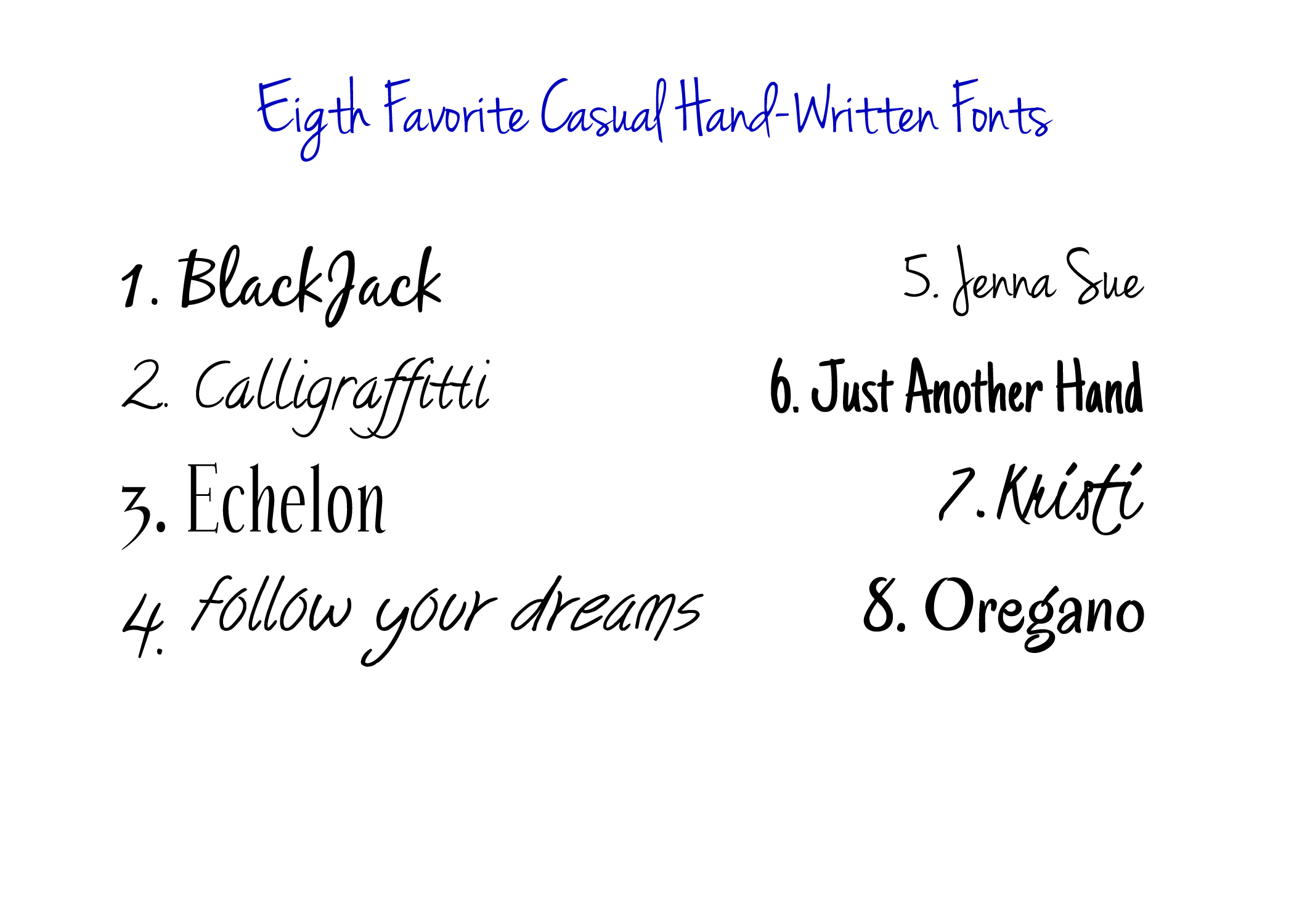
Jenna Sue
Kristi
BlackJack
These 3 fonts can all be downloaded for free at FontSquirrel.com
Calligraffitti Font
Just Another Hand Font
Oregano
Echelon Font Family
These 4 fonts can all be downloaded for free (some would like a donation) at 1001Fonts.com
You can get the Follow your dreams font here
Okay this next group are all great replacements for the dreaded Comic-Sans font. I know, GCU offers it as inside card text, that doesn’t mean you have to use it in your artwork. Any of these fonts offer a more professional look to your humorous designs, and you can still use the Comic-Sans font inside the card to “coordinate” if you must.
Comic-Sans is simply a font that gained so much momentum in the 90’s that it almost replaced Times-Roman as a ‘standard’ font … can you imagine? That’s why it’s not considered a professional choice anymore in greeting card design. It’s well-recognized by professionals in the greeting card industry and your designs may not be taken seriously if you use this font anywhere other than inside cartoon speech bubbles. So, check out these comic replacements!

Bangers Font
Mouse Memoirs
Peralta Font
These 3 fonts can all be downloaded for free from 1001Fonts.com
Spicy Rice
Bubblegum Sans
Slapstick Comic
Snickles
Komika Family
These 5 fonts can all be downloaded for free at FontSquirrel.com
You can purchase Dom Casual here.
Hope you enjoyed this installment of Diaries of a Fontaholic … See you next week for the final installment where I’ll offer some nice ‘Special-Use’ fonts and a few fonts to use with a very light hand!
Share this:

Critique Clinic – February 9-10, 2013
How does it work? For three days a week (Friday-Sunday midnight), I will open the clinic to any artist who wants an honest peer review and critique of a card which gets plenty of clicks but no sales, so something’s probably not quite right, or you’ve got a new design you want to test drive, or you’re unsure about the marketability of a card. Or perhaps you’re a newbie who isn’t sure if a card is up to a marketable standard. Anyone is welcome to participate. In fact, I encourage everyone to at least look at the cards in question and read the critique comments – you may learn something. The purpose of the clinic is to help artists improve the commercial appeal and marketability of their cards.
THE RULES
- ONE card per artist only.
- Card must be intended for sale at Greeting Card Universe.
- To submit a card for critique, post a link to the card at GCU in the comments section of this clinic post. Allowances will be made if you’ve had a card declined, or made a new design you’d like advice on before submission. Give us the link where we can see the card, such as your private gallery, Flickr, Tinypic, etc. If you do give a private gallery link, be sure your private module gallery is ON. Please do not post links to your Manage Cards section – do you really want strangers tinkering with your cards? And please don’t ask us to critique a card that’s pending review – we can’t see it until it’s approved.
- Any artist is free to comment and/or give a critique of a submitted card. HOWEVER, post-and-run comments like “great card” or “you suck” will not be tolerated, nor will abuse. Criticism should be constructive, not destructive. Play nice or you will be banned.
- I also won’t tolerate temper tantrums if you decide your “artistic integrity” is being stepped on because you asked for a critique, and someone told you the photo you’re using isn’t in focus. If you can’t take honest criticism, don’t submit. Once gets you a warning; twice and you’re banned from submitting in the future.
- Artists who critique may do so by giving their opinion, posting an example of another card, or pointing the submitter to a video, on-line article, or other helpful suggestion.
- Don’t forget that artists who are giving you tips and helpful advice are volunteering their time and trouble. Be nice. A link back to their store on your website or blog is appreciated (but not mandatory).
- You are free not to take any advice offered. There’s no guarantee any card will be a bestseller, so don’t come into the clinic with unrealistic expectations.
- Rules may change as we go along and we see how things turn out, okay?
So without any further ado, I declare this week’s Critique Clinic open!


