Dash of Inspiration: Year-end Rewind, Part 2
A Dash of Inspiration, A Cup of Creativity by Doreen
Year-end Rewind, Part 2

Between now and the New Year, all of us will be busy so here is our Part 2 of the Year-End Rewind for those who may have missed any of these great links to design elements; a nice holiday present for all our Newbie artists!
So in our second week of the ‘Year-end Rewind’, it’s Design Elements, some to download and where to find them – ENJOY!
Totally Retro – links to fun elements for download
You’ve Got Style – links to great selections of Photoshop Style Presets
Overlays – Get yours today!
Christmas in July – there are 5 parts to this, so be sure to browse through all of them for lots of goodies
Finding CU Elements – great links to start your journey
Selecting Digital Backgrounds and links to getting some
Easter Egg Hunt – links to egg making tutorials and elements
Have a Heart – get ready for Valentine’s Day
Frame It – links to all kinds of great frames
Next week we’ll continue the Year-end Rewind with a lengthy list of all the great HOW TO tips & tutorials from the GCU Community!
Happy Holidays!
Share this:

Critique Clinic – December 21-23, 2012

How does it work? For three days a week (Friday-Sunday midnight), I will open the clinic to any artist who wants an honest peer review and critique of a card which gets plenty of clicks but no sales, so something’s probably not quite right, or you’ve got a new design you want to test drive, or you’re unsure about the marketability of a card. Or perhaps you’re a newbie who isn’t sure if a recently submitted card is up to a marketable standard. Anyone is welcome to participate. In fact, I encourage everyone to at least look at the cards in question and read the critique comments – you may learn something. The purpose of the clinic is to help artists improve the commercial appeal and marketability of their cards.
THE RULES
- ONE card per artist only.
- Card must be for sale at Greeting Card Universe.
- We will take an unlimited number of artists, including those who have submitted recently, HOWEVER I reserve the right to close a clinic for the day if the submissions become overwhelming. If the clinic has been closed, and you submit a card, your comment will be deleted.
- To submit a card for critique, post a link to the card at GCU in the comments section of this clinic post. Allowances will be made if you’ve had a card declined, or made a new design you’d like advice on. Give us the link where we can see the card, such as your private gallery, Flickr, Tinypic, etc.
- Any artist is free to comment and/or give a critique of a submitted card. HOWEVER, post-and-run comments like “great card” or “you suck” will not be tolerated, nor will abuse. Criticism should be constructive, not destructive. Play nice or you will be banned.
- I also won’t tolerate temper tantrums if you decide your “artistic integrity” is being stepped on because you asked for a critique, and someone told you the photo you’re using isn’t in focus. If you can’t take honest criticism, don’t submit. Once gets you a warning; twice and you’re banned from submitting in the future.
- Artists who critique may do so by giving their opinion, posting an example of another card, or pointing the submitter to a video, on-line article, or other helpful suggestion.
- Don’t forget that artists who are giving you tips and helpful advice are volunteering their time and trouble. Be nice. A link back to their store on your website or blog is appreciated (but not mandatory).
- You are free not to take any advice offered. There’s no guarantee any card will be a bestseller, so don’t come into the clinic with unrealistic expectations.
- Rules may change as we go along and we see how things turn out, okay?
So without any further ado, I declare this week’s Critique Clinic open!
Share this:

Rainbow Connection: Seeing Green for St. Patrick’s Day

St. Patrick’s Day is coming in March. While you’re designing your leprechauns, pots of gold, shamrocks, and other fun seasonal creations, choose your shades of green carefully. You want greens that don’t shade too much into blue or olive. Here’s a St. Patrick’s Day palette with five lovely greens you can combine or use singly, doubly, or with other complimentary colors for a shot of Irish celebration. Have fun!

As always, these are RGB colors. I’ve given you the hex numbers to make it easy to use these colors in your favorite graphics editing program, or you can simply save the palettes to your own hard drive.
Share this:

Custom Corner: Merry Christmas from Mindy, Nasser, and the whole family!
Last week, we brought you a Custom Corner special about Mindy Rosso-Gaemi’s annual Christmas card and gave you a preview. Now here’s the story from the artist who designed the custom card, Micklyn Le Feuvre, and the card itself. Great idea – I love the superhero theme for the holidays.
_________________________
I have only been active here at GCU for the past few months, though I opened my store a couple of years ago. It took me a while to get going here! But I am so glad I finally woke up to what a great opportunity we have as artists with GCU and started to put in consistent effort.
When Mindy first approached me to do her holiday card for her and her family, I was really excited but also nervous, as this was my first custom request ever. She was wonderfully specific about what she was looking for, and gave me plenty of help, links and ideas to get me going. We worked on the outside image first, and after e-mailing back and forth a few times, I managed to complete that design.
Once we had the outside sorted out we began work on the inside. Mindy asked for a “Super Santa” character (in keeping with the superhero / comic style theme she wanted) and I found that part possibly the most fun, as I am always happy with a pencil in my hand!
Before Mindy approached me, I must admit I had no idea we could provide custom inside designs for our customers, and in full color, too! Mindy wanted a comic book frames style design, with quite a few images and quite a bit of text, I found it quite challenging to fit everything in, but very, very satisfying in the end! Though I didn’t get everything right in one go, Mindy was very patient with me and encouraging as I edited and corrected small issues until we were both satisfied.
I am so thrilled and honored that she chose me to do her holiday card, especially after seeing the card that Cherie did last year. (Wow! What an amazing design that is!) I learnt so much and thoroughly enjoyed the whole experience. I feel like I am much better equipped now to work on custom requests in the future, and have also enjoyed the recent blog posts about dealing with customer requests – so helpful!
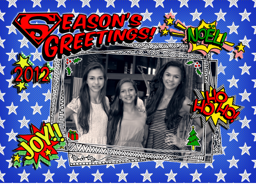
Here’s the front of the card featuring Mindy and Nasser’s three beautiful daughters.
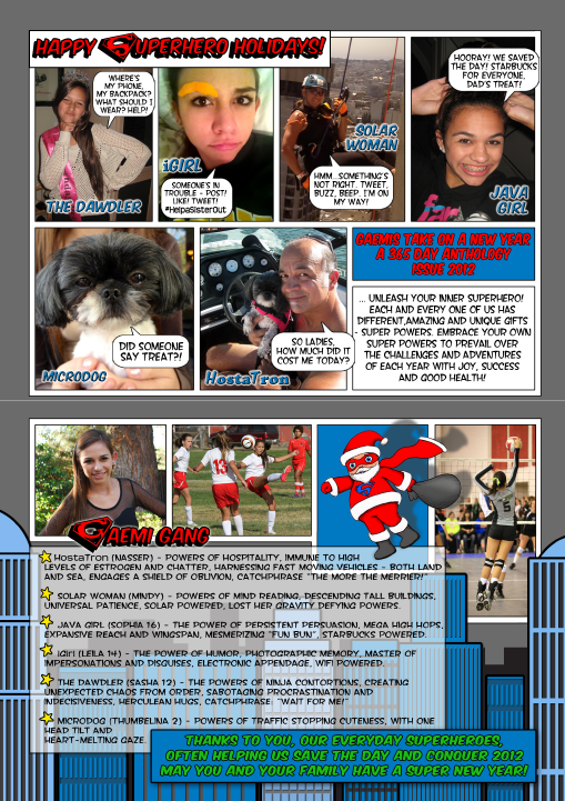
And here’s the inside – cute comic book style!
Share this:

Design Spotlight: Michael Wykowski

Today’s Design Spotlight shines on Michael Wykowski of Mawmaw Cards – his unique illustration style and labyrinth cards really bring a smile to my face!
_________________________

I’ve been working as a graphic designer and illustrator for… well, let’s just say many years. My experience in the arts has lead me through drawings, watercolor and acrylic paintings, a variety of mixed media, illustrated calendars, t-shirts, band posters and CDs, commissioned portraits, animation, music production, mosaics, printmaking, theater posters, comic strips and single panel cartoons, children’s book illustration, postcards, blah blah blah, and of course greeting cards. Lots and lots of greeting cards.
I began creating maze cards in 2010. My first maze card was made for my friend’s daughter who was turning four years old. I had previously made children’s cards that I thought were wonderful, but they never received much attention from the little tykes. I’d spend hours crafting an image and verse that were in a moment cast aside without the least bit of interest. The kids were more excited at opening and playing with the envelope than the card.
One day, I noticed that most activity books for kids always contained a number of simple mazes. Many of these were really nice pieces of art. Since I’d never seen a card with a maze I thought I’d give it a try. It was a wild success! For the first time, a little kid actually was interested in a birthday card. She studied it, played with it, and showed it to her friends and sister — and they seemed to enjoy it as well. Even the adults were fascinated. It was a revelation.
Since then, I’ve created many more mazes for birthday cards, holiday cards (my “Love Cat Maze” card won honorable mention this year in Kate Harper’s Most Unusual Valentine Cards blog), and even an anniversary card that features a double maze (one for him and one for her).
One of my favorites is PenguinPark Maze. It’s a birthday card that’s appropriate for any age, gender, race, or religion. It’s bright and colorful and adventurous and FUN! As a friend said, “Everyone loves penguins, and mazes are cool.” I only posted it a couple weeks ago on GCU and it’s already becoming one of my best sellers.
When designing a maze card, I begin with a concept and shape for the maze. I then start sketching the maze with pencil and paper (and lots of eraser). It’s all done freehand. I determine the complexity of the maze based on the age of the intended recipient — the younger the person, the simpler the maze. With a good maze, it isn’t immediately apparent which path will lead to the “finish.” The challenge is in designing clever dead ends and fitting the paths into the form of the maze. After I layout a satisfactory solution to the maze, I scan the sketch and use it as a template in Adobe Illustrator. I then carefully trace out the maze with the pen tool — straightening lines, perfecting curves, and adjusting proportions. Finally, I add my backgrounds and characters and choose a color palette and type font(s).
As I’m working on the design and production of the maze, I also consider the inside verse. I usually try to find a verse that is a celebratory play on words that are related to the occasion and image. Sometimes it comes to me quite naturally. Other times I have to get out my dictionary, thesaurus, and rhyming dictionary and rack my brain for the right blend of wordplay and sentiment. Hint: I find that long walks or drives quite often help to shake the cobwebs.
I continue to design cards in a variety of illustration styles (many examples can be seen on my website. I’m always working on the next fun idea (and, so far, I’ve had no shortage on that count). But for now, the variations and greeting card applications of my mazes seem almost infinite. I plan to provide GCU with many, many more. Thanks GCU and the GCU Community for allowing me to share my A-mazing cards.
Share this:

Dash of Inspiration: Year-end Rewind, Part 1
A Dash of Inspiration, A Cup of Creativity by Doreen
Year-end Rewind, Part 1
Between now and the New Year, all of us will be busy so I’ve decided to use these next three weeks to gather many of the great tips and tutorials that Corrie, myself and GCU have brought to us for those who may have missed one; and as a nice holiday present for all our Newbie artists!
So in our first week of the ‘Year-end Rewind’, it’s Typography and Fonts – ENJOY!
TYPOGRAPHY
The Text Says it All (lots of links to fonts for you to grab in this one)
Typography Speaks Louder Than Words
Nuts and Bolts: Front of Card Text
GET your FONTS
Always be sure to check the Terms of Use to be sure a font is okay for commercial use.
Font Squirrel’s Favorite Commercial Use Free Fonts
14 Favorite Free Fonts (For Commercial Use) by Jahfer
57 Free Wedding Fonts from Font Space for you to enjoy.
Who Are You Calling a Dingbat?
Font Frenzy: Something Old, Something New
Next week we’ll continue the Year-end Rewind with Design Elements!
Share this:

Critique Clinic – December 14-16, 2012
How does it work? For three days a week (Friday-Sunday midnight), I will open the clinic to any artist who wants an honest peer review and critique of a card which gets plenty of clicks but no sales, so something’s probably not quite right, or you’ve got a new design you want to test drive, or you’re unsure about the marketability of a card. Or perhaps you’re a newbie who isn’t sure if a recently submitted card is up to a marketable standard. Anyone is welcome to participate. In fact, I encourage everyone to at least look at the cards in question and read the critique comments – you may learn something. The purpose of the clinic is to help artists improve the commercial appeal and marketability of their cards.
THE RULES
- ONE card per artist only.
- Card must be for sale at Greeting Card Universe.
- We will take an unlimited number of artists, including those who have submitted recently, HOWEVER I reserve the right to close a clinic for the day if the submissions become overwhelming. If the clinic has been closed, and you submit a card, your comment will be deleted.
- To submit a card for critique, post a link to the card at GCU in the comments section of this clinic post. Allowances will be made if you’ve had a card declined, or made a new design you’d like advice on. Give us the link where we can see the card, such as your private gallery, Flickr, Tinypic, etc.
- Any artist is free to comment and/or give a critique of a submitted card. HOWEVER, post-and-run comments like “great card” or “you suck” will not be tolerated, nor will abuse. Criticism should be constructive, not destructive. Play nice or you will be banned.
- I also won’t tolerate temper tantrums if you decide your “artistic integrity” is being stepped on because you asked for a critique, and someone told you the photo you’re using isn’t in focus. If you can’t take honest criticism, don’t submit. Once gets you a warning; twice and you’re banned from submitting in the future.
- Artists who critique may do so by giving their opinion, posting an example of another card, or pointing the submitter to a video, on-line article, or other helpful suggestion.
- Don’t forget that artists who are giving you tips and helpful advice are volunteering their time and trouble. Be nice. A link back to their store on your website or blog is appreciated (but not mandatory).
- You are free not to take any advice offered. There’s no guarantee any card will be a bestseller, so don’t come into the clinic with unrealistic expectations.
- Rules may change as we go along and we see how things turn out, okay?
So without any further ado, I declare this week’s Critique Clinic open!
Share this:

Design Contest: O Tannenbaum – Winner!


And the winner of our Design Contest: O Tannenbaum is … Lisa Crisafi!
Congratulations to Lisa, and congratulations to Surabhi Seema, who nominated her. Both artists win a prize. Lisa, Surabhi, please contact me at gcucommunity (at) bigdates.com or use the Contact Me link on this page (upper right) and let me know your choice of prize: a $10 Amazon.com gift certificate or 5 free card credits.
Thanks to everyone who particpated and voted. We’ll have a new Design Contest next year. For now, everyone have a safe and happy holiday!
Share this:

Custom Corner: Mindy’s Super Holiday
From the files of Greeting Card Universe comes a new Custom Corner story featuring our very own Mindy Rosso-Gaemi and her annual holiday card.
As always, Mindy chooses an artist whose style speaks to her. This year, she tapped Micklyn Le Feuvre, a South African artist and mother of 10 (!). Mindy says Micklyn was a joy to work with. We’ll have the full story for you later, after Mindy has a chance to mail out her fabulous personalized cards. For now, here’s a taste of what’s to come.
Mindy was inspired by this design of Micklyn’s:

She was also inspired by this:

Here’s the first draft of superhero themed holiday cheer. This isn’t the final version. You’ll see that later, but this will give you an idea:

I don’t know about the rest of you, but I’m intrigued!
Share this:

Dash of Inspiration: Choosing Categories
A Dash of Inspiration, A Cup of Creativity by Doreen
Choosing Categories
I think one of the most difficult areas to master when submitting cards at GCU is Categories; at least it was for me and I still second guess myself from time to time. The best advice regarding category choices that I received when I began my journey at GCU was from Corrie. She said; “A card can only be categorized by what it is, NOT what it could be”. This is a common mistake we make, stuffing cards into categories because it COULD be a good fit. Here are some things I’ve learned along the way about working with categories:
Design for the Category
It’s always easier to get a card approved for a given category if you design for the category, rather than make a design and then try to find categories to stuff it into.
Modify Images for Each Category
There is no doubt that sometimes we are inspired to just create rather than design for a specific category. I’ve found that when this happens, I just create then I go back and use the categories which COULD work for the image as my guideline to make a unique fit for that category. Add elements unique to the category, change colors and message to suit each category. Here’s an example. I lost sleep one night with this ‘from the pack’ idea for a Christmas card where I wanted to create an image with a pack of dogs. Once I had created my pack of dogs, I started working with elements and colors to suit each category I felt fit the ‘from the pack’ theme would work. Here is that series so you have a visual.


Two categories are allowed
BUT not necessary and not always appropriate. For example, this card has two possibilities as a ‘non-personalized’, ‘generic relationship’ card:
Holidays > Christmas Cards > Animals / Pets > Dogs AND Holidays > Christmas Cards > Humor
OR
Holidays > Christmas Cards > General Christmas AND Collections > Animals / Pets Cards > Dogs

Though this card COULD BE for the Veterinarian, pet sitter or pet groomer – it CAN’T be approved for those categories because it does not speak directly to those people. Though it COULD BE for the From the Pet category, again, it does not speak to the pet parent directly.
When in Doubt
When you are not sure of a perfect fit for two categories, then do one of two things. Either make two cards, one specifically for each category OR choose the 2nd category you are unsure of and in your Notes to the Reviewer let them know you were not 100% sure of your category choice and you’d appreciate their help.
Blank Cards
Blank cards can not be added to Occasion Categories just because they are a nice image. There must be something specific and directly related in the art/text on the card front. If there is not, these cards must go into the Collections categories.
There is a lot of great info out there, so I’m not going to go into more detail. I just wanted to inspire everyone who is still struggling, and all the newbies a place where we’ve pulled together all the great tips on learning how to categorize your cards. So go explore and hopefully you’ll have that ‘light bulb’ moment as I did many years ago!
GCU Wiki: This page has a fair amount of detailed into about card categories. This offers very detailed rules/guidelines you should be frequently reviewing when you have doubts.
GCU University: There is a great video on Categorization:
Nuts and Bolts: Categories from May, 2011


