Nuts and Bolts: Dedicate Yourself to the Details – Legibility.
July 17, 2020

Nuts & Bolts – Dedicate Yourself to the Details – Legibility
It is often the little details that escape the artist’s eye. It is always a good idea to step away from a design that you have been meticulously working on or ask a brutally honest companion to give it a once over. The review team is certainly a fresh set of eyes and often catches tiny fixes or areas of improvement. GCU is grateful for artists who are open to collaborating with the reviewers on minor adjustments that make a big difference.
See this example with an improvement in text placement and font choice both leading to better legibility in the final design.
Original Image:
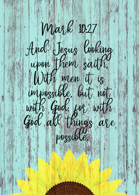
From the reviewer:
The card front text is not very legible against this background. Please adjust the background or text style. Please ensure there are no overlapping lines of text on the card front as seen in this image.
TYPOGRAPHY – Legibility
See the GCU Blog for explanation & examples:
https://gcucommunity.com/2013/06/03/dash-of-inspiration-typography-legibility/
See the GCU Blog for explanation & examples:
https://gcucommunity.com/2013/06/03/dash-of-inspiration-typography-legibility/
Resulting Image:
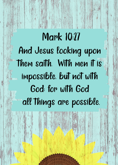
Thank you to GCU artist, Linda Gladman Art, for her quick edits and receptive teamwork with our review team to create a submission that speaks volumes.
Here is another example of before and after improvement for cover text legibility by Angela Castillo of FairyGirlCards.
The difference is in the details.
Mindy
GCU Community Manager
GCU Community Manager
Share this:

No comments yet

