Nuts and Bolts: Dedicate Yourself to the Details – Text Placement.
August 21, 2020

Nuts & Bolts – Dedicate Yourself to the Details – Text Placement
It is often the little details that escape the artist’s eye. It is always a good idea to step away from a design that you have been meticulously working on or ask a brutally honest companion to give it a once over. The review team is certainly a fresh set of eyes and often catches tiny fixes or areas of improvement. GCU is grateful for artists who are open to collaborating with the reviewers on minor adjustments that make a big difference.
See this example by GCU artist, Eileen Forbes of Eileen Forbes Photography, with an improvement in text placement leading to a professionally composed design that shines.
Reviewers request for edits:
Please adjust the placement of the text so it is not touching or overlaying the petal.
TYPOGRAPHY – Text Placement
See the GCU Blog for explanation & examples:
https://gcucommunity.com/2013/06/24/dash-of-inspiration-typography-text-placement/
See the GCU Blog for explanation & examples:
https://gcucommunity.com/2013/06/24/dash-of-inspiration-typography-text-placement/
Before:

After:

Well done, Eileen, and thank you for working so well with the review team. Excellent teamwork!
It may take a little more time upfront to perfect a new design but this will save you time in the long run when creating a like image collection and derivative designs so the follow on designs all shine, pass review, and are highly marketable. See important Pre-approval for Card Series process and tips.
Look at this garden of lovelies!
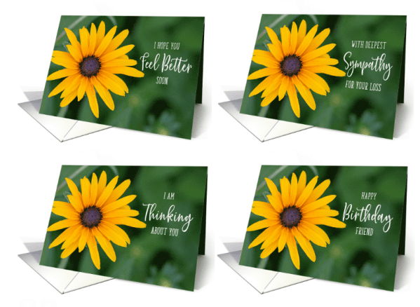
Remember, GCU allows an image to be leveraged into a like image series of cards, see Leveraging Designs.
The difference is made in the details!
Mindy
GCU Community Manager
GCU Community Manager
Share this:

No comments yet

