Wanted New Cards: Thank You Plastic / Cosmetic Surgeon

Plastic surgery is defined as a surgical specialty dedicated to reconstruction of facial and body defects due to birth disorders, trauma, burns, and disease. Plastic surgery is intended to correct dysfunctional areas of the body and is reconstructive in nature

Share this:

Freebie Wednesday: Boatman Font
Freebie Wednesday:
Creative Fabrica has a new freebie up for grabs! The Boatman (by YdhraStudio) is an all caps, vintage display font inspired from classic whiskey labels and sing painting. It comes in 3 styles: regular, outline and stamped, which extends the design possibilities. Don’t wait too long, this offer will be good for the next 5 days only.


This product comes with a complete commercial license.
Share this:

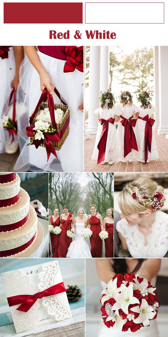
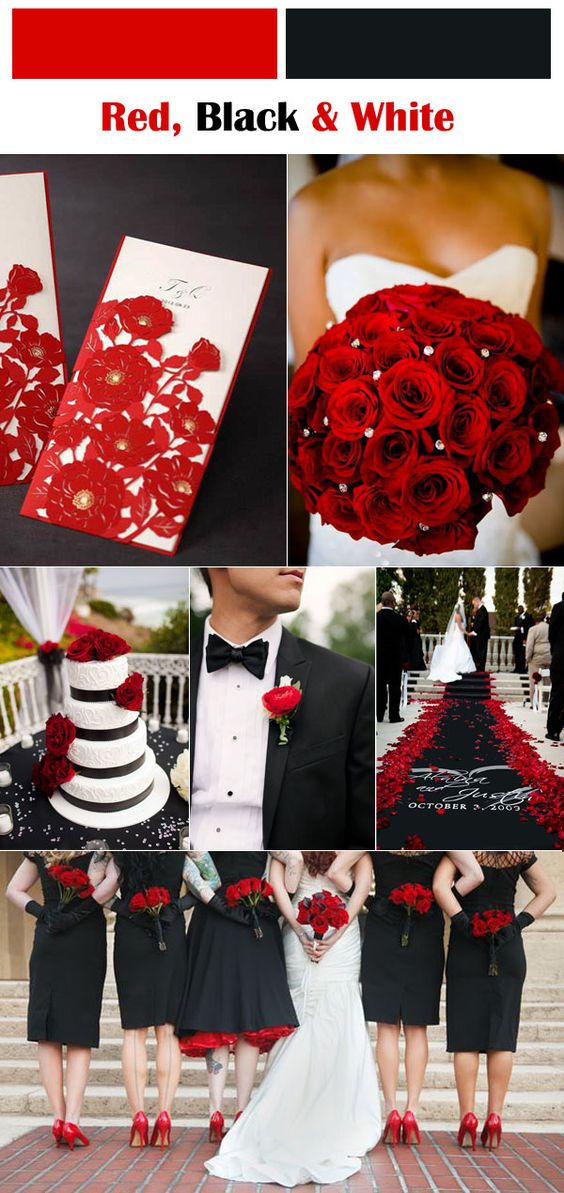
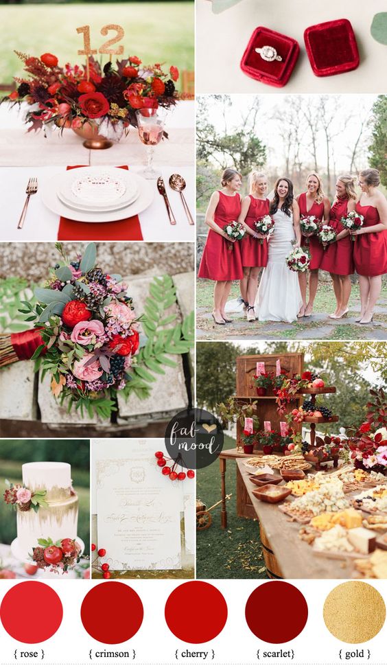
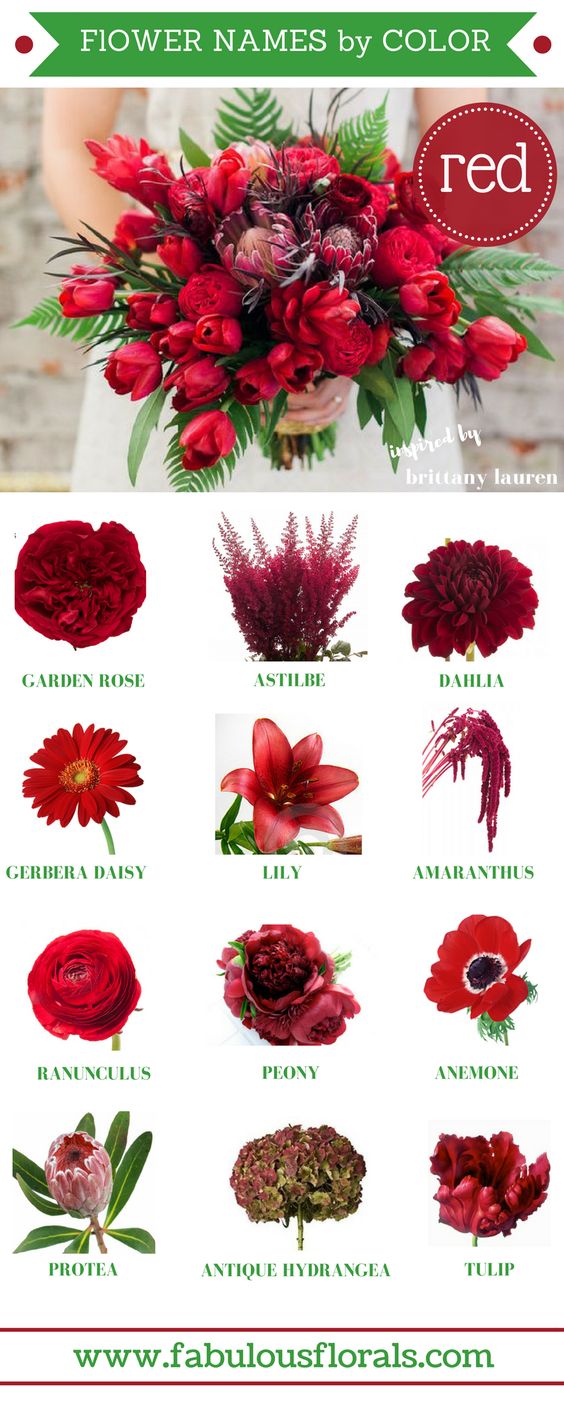
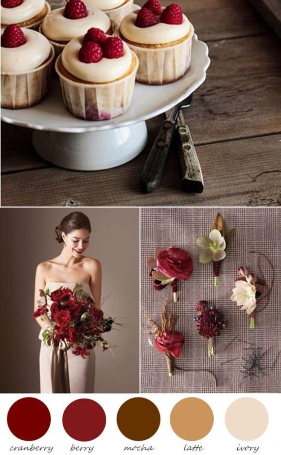
Rainbow Connection: Red Wedding

Red Wedding
What it’s the first color that comes to your mind when you think about love? Of course , it is red, a color of valentine’s day! Bold, beautiful, warm and intimate, red can be that one color that really makes your fall and winter wedding pop. Here are some color ideas I picked up from the internet:

Share this:

Nuts and Bolts: Word Cloud Art.

Nuts & Bolts – Word Cloud Art
Word Cloud art is very popular and still trending. A Word Cloud or Tag Cloud is simply a weighted list of terms displayed visually, originating from actual word clouds, which are a technological representation of related terms like keyword metadata or tags. They’ve now crept into the art world and resonate with people as they are quite literal and can be mesmerizing. A variation on word clouds is using different colors, sizes and fonts. As typical, with a traditional word cloud, more popular terms are larger in size. Some clever word clouds are fashioned in the shape of a related object.
There are many word cloud generator tools. Note these are purposeful for a variety of reasons like workplace presentations, classroom education, marketing and as we’ve discussed here artwork. You can also use desktop programs to create your own word cloud and use shaping tools. Since most desktop software do not have the ability to layer and place text, we suggest the following modification: You can create your own word cloud to emulate those created by generators, using creative software such as; Photoshop and Illustrator. The savvy artist is capable of layering lines of text into shapes and visual art which give the impression of word clouds.
Important to know that, however you create your Word Cloud art, as with all forms of art, your submissions must meet GCU’s submission guidelines.
Here are some tips, dos and don’ts when creating Word Cloud art for greeting cards that we hope are helpful to you:
– Don’t randomly and haphazardly put text all over the card front
– Limit the number of colors of text. Usually two, sometimes three is visually all the eye can focus on.
– Keep font choices down to two or perhaps three. See: https://gcucommunity.com/2014/02/13/tips-and-tricks-pairing-fonts/
– Use font styles to cause visual changes within the same font family such as; italics, bold, uppercase, lowercase lettering.
– Varying font sizes is also a way to create visual impact.
– Be sure to make a new and unique design.
An additional note: If a word cloud generator tool is used, be sure to not only read through the Terms of Use for resale, but be prepared to provide links to the TOU in your Notes to Reviewer.
The key is to create balance and harmony while not stepping over the line into chaos.
This type of style needs to have some text which clearly makes a statement while be supported by the rest of the words on the page.
Typography rules still apply. See: https://gcucommunity.com/2018/03/07/dash-of-inspiration-typography-the-golden-rules-2/
Here are some generated word clouds which work:
Here are some examples on GCU that work:


See this related post on GCU’s submission guideline for Typography: Font Combination:
https://gcucommunity.com/2013/05/27/dash-of-inspiration-typography-font-combination/
GCU Community Manager
Share this:

Wanted New Cards: Beauty Tech Holiday Cards

We’d like you to create at least one card for these categories using the Stock Cards function (Bigstock) or your own graphic designs.
Remember, when you’re submitting your new card, add a little note about the intended category in your Notes to Reviewers. Be inventive, be clever, be creative. Go for it!
Share this:

Freebie Wednesday: 80 Seamless Hand Drawn Patterns and Textures.
Freebie Wednesday:
The Hungry JPEG has a massive 5 year celebration extravaganza going on with lots of heavy discounts and freebies so be sure to check out their deals!
80 Hand Drawn Patterns and Textures by Qilli is a vector background bundle, retro style. These textures can be used in a variety of projects such as posters, postcards, flyers, t-shirts, typography and etc.
Included in this set:
• 80 Layered .EPS10 (vector) files
• 80 .PNG files on transparent background (5000 x 5000 px)
• 2 .AI files
Software compatibility: Adobe Illustrator CS or newer. .EPS files will work with a variety of programs such as Adobe Photoshop or Illustrator, Sketch, InkScape, Affinity, Corel Draw, etc. .PNG files will work with most graphic software.
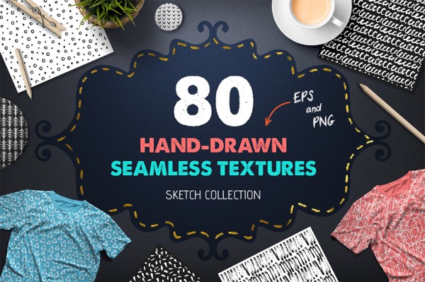
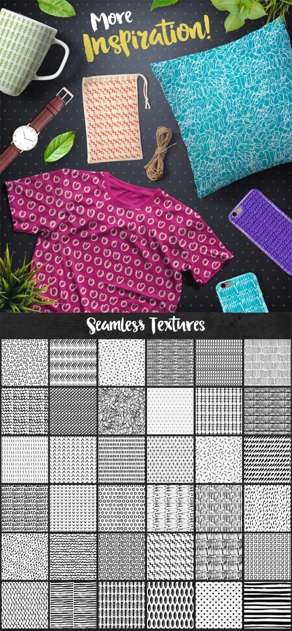
This product comes with a complete commercial license.
Share this:

Rainbow Connection: Werner’s Nomenclature of Colours.
Werner’s Nomenclature of Colours
First published in 1814, Werner’s Nomenclature of Colours is a taxonomic guide to the colors of the natural world that has been cherished by artists and scientists for more than two centuries. The beautiful pocket-size facsimile (available on Amazon) is certain to delight and inform a new generation of artists and scientists. Werner’s Nomenclature of Colours is a charming artifact from the golden age of natural history and global exploration.
In the late eighteenth century, mineralogist Abraham Gottlob Werner devised a standardized color scheme that allowed him to describe even the subtlest of chromatic differences with consistent terminology. His scheme was then adapted by an Edinburgh flower painter, Patrick Syme, who used the actual minerals described by Werner to create the color charts in the book, enhancing them with examples from flora and fauna.
In the pre-photographic age, almost all visual details had to be captured via the written word, and scientific observers could not afford ambiguity in their descriptions. Werner’s handbook became an invaluable resource for naturalists and anthropologists, including Charles Darwin, who used it to identify colors in nature during his seminal voyage on the HMS Beagle. Werner’s terminology lent both precision and lyricism to Darwin’s pioneering writings, enabling his readers to envision a world they would never see.
Also visit Nicholas Rougeux‘s site to see a recreation of the original color guidebook with new cross references, photographic examples, and posters.


Share this:

Nuts and Bolts: Give Your Low to No Sellers a Facelift III

I updated the above pid. I cleaned up the image and added more contrast and stronger lines so it would print better, at least I think it will. I changed the inside too. Could you please take a look and see if this is acceptable? This cover image is on two other cards, if this is okay I would like to change the cover on the other two as well.

GCU Community Manager
Share this:

Wanted New Cards: Holidays for Librarian

We’d like you to create at least one card for these categories using the Stock Cards function (Bigstock) or your own graphic designs.
Remember, when you’re submitting your new card, add a little note about the intended category in your Notes to Reviewers. Be inventive, be clever, be creative. Go for it!
Share this:

Freebie Wednesday: Rustic Station
Freebie Wednesday:
Rustic Station (designed by Maulana Creative) is this weeks free font on offer at The Hungry JPEG. Don’t wait too long, the offer expires in 6 days!


This product comes with a complete commercial license.


