Wanted New Cards: Getting your Wheelchair / Walker

We have a brandnew categorie that needs your attention:
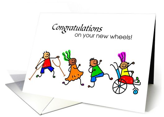
At the moment there are 1 card in this category.
We’d like you to create at least one card for these categories using the Stock Cards function (Bigstock) or your own graphic designs.
Remember, when you’re submitting your new card, add a little note about the intended category in your Notes to Reviewers. Be inventive, be clever, be creative. Go for it!
Share this:

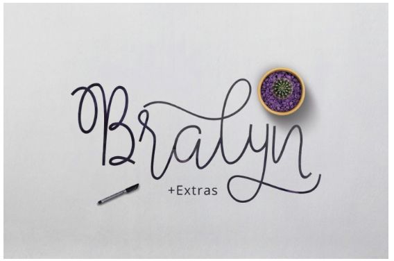
Font Frenzy: Bralyn Script

The Hungry JPEG has a lovely $1 script font on offer called Bralyn Script by Van Roem.
Bralyn Monoline Script is a new modern calligraphy Script font, combines from copperplate to contemporary typeface, classic and elegant touch. With extra bouncy curves & loops, Bralyn Script is guaranteed to make your text stand out – perfect for logos, printed quotes, invitations, cards, product packaging, headers and whatever your imagination holds.
Bralyn Monoline Script features 271 glyphs and alternate character contain with opentype features. Stylistic alternates, Swash Alternates, Ligature and more.

Share this:

Rainbow Connection: PatternCurator

PatternCurator is a trend forecast company focused on print, pattern & color inspiration. Their goal is to inspire artists and designers. PatternCurator is trend obsessed – especially when it comes to print, pattern & color. This obsession has them scouring the world, looking at anything and everything that could be current and upcoming trends. They provide an inspiration resource for design professionals and aspiring designers alike.

Here is an example of one of their mood boards. They state all their sources with clickable links and there are plenty of choices saving it to social media like facebook and pinterest.

Share this:

Dash of Inspiration: Wedding Series

Knowing the latest trends for the upcoming wedding season and offering designs which coordinate with the bride’s color palette can mean sales. Today I thought I’d share some tips, trends and freebies for your wedding series.
- Do review your old designs and consider changing the color to a palette for the upcoming season. This not only gives an old card a refreshing look, but you don’t have to work so hard to get that new card seen. Updating old cards keeps their place in both GCU’s marketplace and external searches.
- Do keep in mind that black and white, gold, silver and cream hues will always be in style for weddings, so those cards you can keep trendy by with updates to your typography and embellishments, but there is no need to change colors on those old cards. They will always in ‘in season’.
- Rather than making many different colors for brides to choose from of the same design (you’ll never have the right combination for every bride), consider this trick:
- Use a different color palette from the season’s choices for each of the sub-categories, such as; bridesmaid, maid of honor, etc. This shows brides a wider range of color combinations all in the same design without flooding their viewing experience with many duplicates.
- Then in your Card Descriptions (Artist Notes), make a point of letting the brides know there are many colors available and you, the artist, are willing to help them find the exact color they’re after.
- When you reach the color limit on GCU, remember the three-times-rule, add one of each additional color combination to your Private Gallery and use that as a ‘show room’. Let brides know in your Card Description and/or when they contact you, they can view more color options in your private gallery accessible through your storefront.
- When you create a series of wedding cards, don’t just use the same image over and over again with different text on the front. Be more creative. Add and reduce elements to create a more personal touch to some of those categories. Cards for groomsmen should be similar in design, but should also have a masculine feel while still coordinating with the overall design.
- Save yourself some time by using the Custom Front text option whenever possible for those special categories. Example: Relation-specific, wedding attendant thank you, ‘be my’ less common categories, etc. This offers you a larger opportunity for sales as the savvy bride will choose one and change the name/relation on the front.
- Don’t mislead customers by using terms like glitter, embossed, flecked. Always be upfront in your keywords, card title and card description that these are all digitally created to represent the real thing. Use defining words and phrases like; faux, visual only, digitally applied, replicates the appearance of, or can’t be felt to the touch.
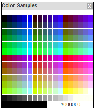
- When you use a color palette, such as the one I offer in this post, use the color number and/or name of the color on the chart in your meta-tag data and most certainly in your Card Description. Not only will search engines pick up your series for brides searching for that specific color palette, you will be giving the customers a realistic color to work with. If you do this, BE SURE you have used the actual color number associated with the name of the color to create your designs.
- Do think up unique offerings in your design and wordsmithing, and offer variety from subtle and elegant to bold and edgy. There are brides of every kind, in every walk of life and you will serve yourself best as a designer to stretch your creativity and go outside the traditional box once in a while.
Wedding Trends for 2016
10 Top Wedding Colors for Spring of 2016 from Elegant Wedding Invites.com
25 Hot Wedding Color Combination Ideas 2016 by Tulle and Chantilly.com
The Hottest New Wedding Trends for 2016 by Bridal Guide.com
Freebies
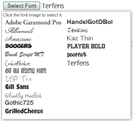
Fonts are critical to occasions – for your formal wedding designs, be sure to match an elegant script font with a more tradition font for a beautiful pair. Such as these combinations from our friends at FontSquirrel.com:

and Cormorant


………………………………
Until next week – Learn . Create . Inspire!
Don’t forget to check out our monthly Design Challenges!
Share this:

Nuts and Bolts: Punctuation – Ellipsis, Abused & Misunderstood

The correct punctuation in using an ellipsis is to leave a space after the last word and before the ellipsis, or vice versa at the beginning of a continuation of a sentence. For example ”I was just thinking … ” or ”… about your birthday”. Including a space in between each mark ”. . .” as well as no spaces in between ”…” are both allowable and most importantly ellipses ALWAYS consist of exactly 3 marks – no more, no less. If you end your cover verse with an ellipsis you should begin your inside verse with an ellipsis as it is useful to indicate that the card front sentence finishes on the inside verse. An ellipsis should not be used to continue a sentence that both starts and ends on the card front. Lastly note, the first word following an ellipsis, and the required space, should begin with a lowercase letter unless the first word is a proper name or the pronoun I.
Share this:

Wanted New Cards: Congratulations Internship
We have a list of sub-categories that need your attention:

Most of the sub-categories have 0 cards in them.
We’d like you to create at least one card for these categories using the Stock Cards function (Bigstock) or your own graphic designs.
Remember, when you’re submitting your new card, add a little note about the intended category in your Notes to Reviewers. Be inventive, be clever, be creative. Go for it!
Share this:

Tips and Tricks: Free Light Bulb Sign Letters

Spoon Graphics offers a Free Light Bulb Sign Letters Pack.

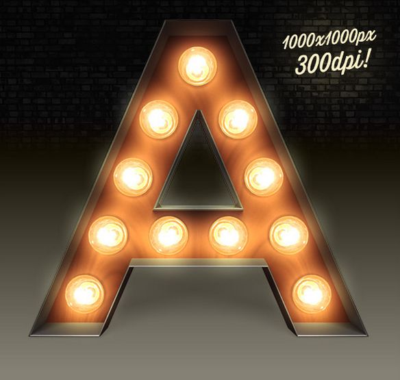
These vintage style light bulb signs have been crafted using Photoshop’s 3D tools and combined with special lighting effects to create a full alphabet of letters that can be arranged to form complete words. Each letter has a wood effect background and realistic bulb graphics that give off a vibrant incandescent glow. They’re approximately 1000x1000px in size at 300dpi, so they’re perfect for use in both digital and print design projects.
Share this:

Dash of Inspiration: Coordinating Custom
Having to search for my own post from years back to reference while card making this past weekend, I thought I’d pass on these Custom Front Card tools, tips and tricks for those of you who need a reminder – and – for all those newbies out there.
- Make the text and photo areas of your Custom Card PLANNED elements when you create your design – DO NOT make them ‘after-thoughts’.
- Attempting to create a photo card out of a previous non-photo-card design, rarely works and is most likely a waste of your time. Check out these examples.
- DO NOT try to stuff your card front text in whatever space may be left after you consider your design complete.
- When planning the design of a photo-card or custom text card at GCU, whenever possible, choose a color for the text within your card front that matches the GCU custom text color palettes. We’ve provided this tool to you over the years and it’s including again in this post. Click here for a downloadable version you can use to color pick in your design programs to match your design colors to the card front text colors on your custom front card. Makes for a more professional design!
- Remember when designing a custom front card, whether a photo-card with custom text or just custom front text, that the typography you use embedded into your design, must be able to pleasingly coordinate with the custom text font you choose from GCU’s options. Click here for a post with links to obtaining the fonts offered through the custom front options at GCU so you can add some or all of them to your own font collection.
- Be confident in your creation of Custom Front cards. Once you create a custom front card by creating a text box or transparent area and saving those placement areas, you can not return that card to a Standard style. In other words, there is no going back, no way to remove custom text boxes and transparent boxes entirely – the system will not allow you to save complete removal. You’ll need to delete the card and start over as a Standard card. So think it through carefully.
- Placeholder images – ALWAYS use placeholders from GCU’s selection which offers shoppers a much more consistent and professional experience when browsing photo-cards. The ONLY exception should be when your card requires a need that the GCU placeholder offerings simply can not fulfill. Such as; unique pet requirements, black and white selections, etc.
- Many of us artists at GCU, prior to GCU creating the custom front tool, created personalized cards. Today, IF you choose to make specific NAME cards (Carol, Clara, Clarice, etc.) put some thought into your time and effort first. If there is nothing terribly unique about the way the name is added to the card front, then create only one per each letter and place them in the appropriate Custom Name categories. This means you create 26 cards instead of hundreds, thereby allowing the customer to change Clarice to Carol if they so desired. You’ll increase your chances for sales and improve the browsing experience for customers.
Hope you find these tips and links helpful. Enjoy and go create!
______________________________________
If you haven’t already, be sure to check out our February Dash of Inspiration Design Challenge!
Share this:

Wanted New Cards: April Fool’s Day Wedding Anniversary
We have two new sub categories that needs your attention:

At the moment there are 0 cards in these categories.
We’d like you to create at least one card for these categories using the Stock Cards function (Bigstock) or your own graphic designs.
Remember, when you’re submitting your new card, add a little note about the intended category in your Notes to Reviewers. Be inventive, be clever, be creative. Go for it!
Share this:

Font Frenzy: Monkuta Script
The Hungry JPEG has added a Crafts Font Category to their store. They will be adding new, affordable fonts regularly. A real treasure trove for us card designers and a perfect way to add some affordable professional fonts to your collection!
Like this lovely Monkuta Script from Joelmaker for only $1.
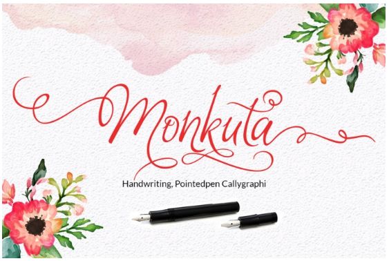

Monkuta script a handwritten script with a pointed pen, calligraphy modern with smooth lines, pointy-edged pull pen, a blend of classic and modern touch and elegant. Can be used for various purposes.such as the title, signature, logo, correspondence, wedding invitations, letterhead, signage, labels, newsletters, posters, badges, etc,Monkuta Script features 423 glyphs. and has given PUA unicode.


