Tips and Tricks: Free Resources


These days, if you’re looking for free resources for your artistic designs, there are Internet sites you can check that will point you in the right direction. Please note: “free” doesn’t necessarily mean free for commercial use. Be sure to check TOU/licensing terms before you use anything you download from the Internet on your cards.
Makerbook is a site listing places you can get free resources including fonts, textures, color swatches, etc. Something for illustrators and photographers here.
Another place you can check which updates frequently is Growth Supply, which lists all kinds of resources for design as well as for marketing, business, etc.
Have fun!
Share this:

Inspiration Station: How to Regain Your Inspiration


Our friends at Make Use Of have posted a very interesting and informative article, How to Regain Creative Motivation After You’ve Burned Out. The article contains some very good advice for artists who are feeling drained and are in need of a little motivation to get themselves running again. Great for newbies and experienced artists. Check it out!
Share this:

Font Frenzy: Alpha Slab One

The Alpha Slab One font, when used in all caps, mimics the very trendy, super fat and chunky serif fonts we’ve seen cropping up in advertisements and on TV. It’s an attention getter, so you want to use this emphatic font mainly for typography type cards or with minimal graphics so they aren’t overwhelmed. And it’s free for commercial use. You’ll see an example below. Have fun!

Share this:

Dash of Inspiration: Marketing Monday
A Dash of Inspiration, A Cup of Creativity by Doreen  If you’re like me, you want to understand SEO and how it can be applied to our specific needs in simple terms. So this SEO Cheat Sheet is the best I’ve seen, and I’d consider it a MUST READ for the online artist.
Search Engine Optimization For Dummies, 5th Edition by Peter Kent
There is a book too, if you’d like to grab that for more detailed information. The image is linked to the book page.
 ………………………………………………………
Though keywords may not be as critical for search engines as they used to be – knowing how to choose up to ten of the most popular keywords which directly relate to your card’s occasion and subject can be a very valuable addition to your content.
Never spam – adding keywords which do not directly relate to your specific product is likely to cause your product link to fall to the bottom of the search list (therefore never found) and/or some search engines (and POD sites) will ban you for misdirecting traffic to that which is truly not relevant.
How To Find The Keywords People Are Searching For Online
………………………………………………………
If you read the above, you now understand that CONTENT is key to each product being found. This might help you get past this roadblock if writing is not something in your powerhouse of skills.
The Secret To Writing Product Descriptions For Ecommerce Success by Trin Salaloy
………………………………………………………
So until next week … Learn … Create … Inspire … and MARKET Your Cards!
Share this:

Every week, we showcase a GCU category that has few or no cards. We’d like you to create at least one card for this category using the Stock Cards function (Bigstock) or your own graphic designs.
Remember, when you’re submitting your new card, add a little note about the intended category in your Notes to Reviewers – cards submitted for underused categories are much more likely to be approved provided they follow the Submission Guidelines. Be inventive, be clever, be creative. Good luck!
Today’s category with 1 card is:
Holidays – Ramadan – Customize for Any Relationship

Share this:

Inspiration Station: Hottest Design Trends 2015
If you’re looking for the cutting edge of trendy artistic design, we’ve got the scoop right here! Incorporating trends into your work not only brings freshness to your art, it’ll attract shoppers’ attention. Don’t forget proper keywords and product descriptions – these are your most important marketing basics.
Watercolors

Watercolors in every hue are extremely hot! Incorporate a watercolor background or watercolor elements. Check around for watercolor textures, brushes, even programs that allow you to convert text into a watercolor effect (but before you invest, be sure your graphics editing program fits the requirements). Or make your own watercolor textures to use – here’s a video to get you started: How to Create Watercolor Textures in Photoshop.
Retro/Vintage
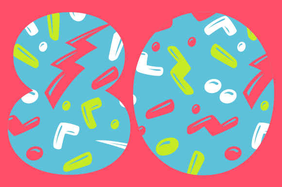
The 80’s and 90’s are making a comeback in the retro scene. Think cool neon graphics, bright colors, futuristic geometric patterns, metallics and glitter, Day-Glo, black light, spray can graffiti, colored animal prints and cassette tapes. Space and galactic themes are coming in too. Check out 80s Designs on Pinterest and 50 Mind Blowing Retro-Style Photoshop Illustrations for plenty of inspiration.
Flat Design

You’ve seen it cropping up everywhere, from websites to software – a minimalist graphic style that’s incredibly modern and appealing called flat design. The important thing to remember about flat design is this: for such a pared down style to be successful, the shopper must immediately grasp the meaning and intent of the image. For more info, check out The Beginner’s Guide to Flat Design and Flat Design on Pinterest.
Now you’ve got some new ideas to play with, so get designing and have fun!
Share this:

Inspiration Station: Bible Inspiration

Many categories lend themselves to religious cards with Bible verses such as Get Well, Congratulations, Sympathy and others. If you’re looking for inspiration, check out Pinterest – a fantastic resource. One caveat you should heed: not all Bible translations are in the public domain. Some are copyrighted. If you find a verse you like, be sure you use a non-copyrighted version of the Bible (such as the King James) in your designs. Use your own judgment as to which verse will be most appropriate and relevant for your intentions.
![]()
Here are some links where you can get inspired:
Elsewhere on the Internet, you’ll find other sites of interest.
25 Bible Verses to Give You Peace
18 Bible Verses for Sympathy Cards
Share this:

Dash of Inspiration: Principles & Elements Design
A Dash of Inspiration, A Cup of Creativity by Doreen In any ‘industry’, success means many things, but one of those is to understand the ‘language’ of the industry and be able to apply the ‘rules’ of the trade with consistency and quality. In design, there are Principles of Design and Elements of Design – for each, there are terms you should be familiar with in order to properly communicate with customers, other designers, even the reviewers – and each of those terms is an item you should be able to incorporate into your designs with a full and complete understanding. Just like photography, you can’t ‘break the rules’ until you have mastered the ability to flawlessly execute those rules.
These two references, courtesy of Patrick Butler, make great tools for you to keep on hand.

 ………………………………………………………
For those of you who are inspired to dive deeper into these areas and give yourself a lesson, or refresher course, on how to recognize principles and elements of design; and how to make practical use of them in your designs, here’s some ‘homework’ for you …
Design elements are the basic units of a painting, drawing, design or other visual piece and include … continue this very complete listing and explanation of each at Wiki.
Graphic Design Tutorials from About Tech
………………………………………………………
Now, if you’ve really studied and are ready to fully apply the Elements and Principles of Design into your work; here’s a fun, but challenging, test you can take. You may find a weak spot in your technique or understanding that deserves further study and in doing so, you might make a positive impact on your future designs!
If you take the test, please come back and share how well you did compared to what you thought you knew. It would be fun to hear what everyone thinks.
Principles of Design Test – How Much Do You Know?
………………………………………………………
So until next week … Learn … Create … Inspire!
Be sure to create an entry for our May Dash of Inspiration Challenge too, there is one more week left for entries and you can fast track your entry!
Share this:

Tips and Tricks: Getting Likes on Facebook

Some artists use Facebook as a marketing tool to draw attention to their business. Make Use Of’s handy new article, Increase Facebook Likes the Right Way (and What Not to Do) contains plenty of tips on what you should be doing and what you should be avoiding. Check it out if you’re looking for a nifty how-to or some pointers!
Share this:

Rainbow Connection: Pantone Spring 2015 Colors

We’ve talked about the return of pastels to trendy designs and fashions. Here’s Pantone’s 2015 Spring Color forecast and as you can see, there are some luscious colors here. Grab this palette and run with it in your new designs! These colors will be popping up all over the place including wedding invitations, etc.


