Dash of Inspiration: FREEBIE Monday
A Dash of Inspiration, A Cup of Creativity by Doreen  Hope all of you had a beautiful Mother’s Day. Today I have an eclectic grouping of finds I wanted to pass on in hopes you too will find them useful. As always, please be sure to carefully read the TOU for each and include the URL in your Notes to Reviewer.
………………………………………………………
PANTONE® Color Report for Fall 2015
 ………………………………………………………
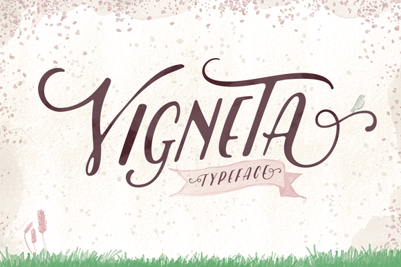
Vigneta Typeface from Creative Market
 …………………………………………………………….
Big Doodle Vector Bundle by Heather Green Designs (aka HG)
freebie: for one week only, big doodle vector bundle
 …………………………………………………………….
Spring Flowers – PNG format – from Roula33 at deviantART
 …………………………………………………………….
Flag Carrier Vector and PS Shapes
 …………………………………………………………….
So until next week … Learn … Create … Inspire!
Be sure to create an entry for our May Dash of Inspiration Challenge too!
Share this:

Wanted: New Cards – Canada Day, Across the Miles

Every week, we showcase a GCU category that has few or no cards. We’d like you to create at least one card for this category using the Stock Cards function (Bigstock) or your own graphic designs.
Remember, when you’re submitting your new card, add a little note about the intended category in your Notes to Reviewers – cards submitted for underused categories are much more likely to be approved provided they follow the Submission Guidelines. Be inventive, be clever, be creative. Good luck!
Today’s category with 2 cards is:
Holidays – Canada Day – Across the Miles

Share this:


Sometimes Adobe offers outdated versions of its graphics software free. At the moment, you can get Adobe products including whole CS2 Suite for free directly from Adobe. Check out this Google Doc document – the link at the very top of the chart is to the site where you can download free products, but if you don’t already have a log-in, you’ll have to register. The document contains a list of everything being offered free.
Photoshop CS2 is old, but you can still get plenty of basic function out of it. If you’ve ever wanted to try Photoshop, now’s the time to do it without spending a penny. You’ll find you have to pay careful attention to extras you may want to download like Actions or brushes – be sure they work with CS2. We used CS2 for years before we upgraded.
PLEASE NOTE: We have not personally tested this link or the downloads on the Adobe site, but since the offer comes from Adobe’s official site, we consider it legit.Also be aware these sort of offers are very popular; availability and download speed may be affected. Also, CS2 is no longer being updated. Use at your own risk.
Have fun!
Share this:

A Reminder About Custom Requests
This is a vintage Dash of Inspiration post we’re running again as a refresher on Custom Requests. Thanks, Doreen!
Customer Requests – Yes or No?
First thing you need to decide is whether you wish to accept customer requests. There are a few things to consider here. I know not all of you can respond quickly. I think one of the reasons I have a good turn-around for custom requests is because being a designer is how I make my living, so from the time I get a request to the time the card is available in my Private Gallery is usually a couple of hours; so I’ve kept the customer’s attention and therefore make the sale.
- Do you keep your original card files (not the jpg/png versions you upload) organized so they are easy to find and saved in layers so that changes are quick? If you have to spend more than 10-minutes getting to the original file and making a quick change, then custom requests may not be for you.
- How long would it take you on average from the time you get the response to the time you can create the changes? In other words, if you work full-time and can only work on GCU cards on the weekends, it may not be worth your time to accept Custom Requests.
- How many as a minimum order is acceptable to you? I have mine set for 5, for a year I had it set to 25 and here’s the thing; customers don’t pay any attention to that number. So, if you say YES in your global preferences, understand that you will get requests for 1 card and be prepared to handle the request professionally whether you accept of decline the request.
Setting up for Custom Requests
Set up for this module can be found here: Manage Store >> Image and Cards >> Global Preferences
Set the minimum order quantity.
Add a message to the module. Use this message area to leave a professional message to communicate to the customer. Here is what I have in my message:
“Thank you for your interest in my custom cards. I will get back to you within 24 hours (except during weekends and holidays, when it may take a little longer). PLEASE NOTE: I may be getting in touch with you via my personal email – ?????.com – so be sure to check your spam folder if you haven’t heard back from me within 24 hours. Regards; Doreen Erhardt”
If you will be away on vacation for example; use this area to change your message to reflect that you will be gone from … to …, you can also turn this module off while you are away.
Why Accept Custom Requests?
For me it’s all about customer service. I’m a customer of many stores and I know that sometimes the reason I will return to a particular store is not only because of the good quality, but also because I was respected as a customer. Questions I asked were quickly and completely answered, requests I made were responded to with a willingness to please, and I found those I communicated with knowledgeable, pleasant and professional. These customer service qualities not only give me a reason to offer a positive rating to the store and product, but will also have me sharing my good experience with friends and family; thus offering a great network of potential new customers for that store.
If you open yourself up to Custom Requests, there is no doubt you will get the occasional request that you spent time on with the customer never coming through. If you simply can’t live with that, then ‘just say no’, but I think you’ll find that IF you respond within a few hours to the request, IF you make that simple change for only 1 card, and IF you get the customer their custom card within 24-hours of their request; you are not only likely to make that sale, but you are likely to have that customer return to your store the next time they need a card.
I have a woman who I asked me well over a year ago to put her friend’s name and age on a card. It was quick and easy for me to do, and it made her day. Since that first card, she returns to my store several times a year. Sometimes she just pops in to say hello and that she didn’t need customizing, but wanted me to know she found just what she was looking for; other times she doesn’t hesitate to request a quick change. My good Customer Service skills have given me a long-time customer who probably tells her friends and family who then come to GCU for their cards.
I will also note that when I get a request from a customer that wants major changes, I communicate back and forth with them first as Corrie suggests, even then 50% of the time the customer doesn’t come through with the purchase, but these little changes which are quick and easy are almost always a quick sale!
So you decide if these are worth your time, who knows how many ‘customers for life’ you might attract in the long way!
Here is last week’s post if you missed it: Nuts & Bolts: Handling Custom Requests.


HERE ARE SOME ADDITIONAL TIPS FROM CORRIE:
- After uploading your custom card (and it has been approved if you wish review), you can easily add the card to the requesting shopper’s cart. Just add the card to your own shopping card and go to checkout. You’ll see an option on the right side of the page: Share Card Link. Click the option. You’ll get a link to send to your customer plus the card will be put in their shopping cart. This is important: you do not need to buy the card, but you must leave it in your shopping cart until the customer has made the purchase.
- Stay in contact with the customer. Your first e-mail should include the information NOT to make a purchase until you inform them their card is ready.
- If a customer jumps the gun and buys the original card instead of waiting, contact GCU by phone at 877-347-6784 (M-F 8am to 6pm PST) or send an e-mail to kc (at) bigdates.com.
Share this:


![]()
A go-to spot on the Internet for quick inspiration is Pinterest. You can do searches for entire boards or individual pins. Here are a couple of places I turn to frequently to get inspired.
Pinterest Most Popular
An ever-changing collection of the most popular posts people are pinning and sharing. It’s very eclectic, but I’ve found everything from neat color combinations to new design elements. This is the hot stuff, so keep your eyes peeled for developing trends. You’ll spot them here first.
Pinterest Trends: Pastels
Soft pinks, robin’s egg blue, seafoam green … pastels are making a big comeback and not just for Easter! We’re seeing pastel colors popping up in everything from hair colors to bedding, paints, accessories, nail polish, etc. Now’s the time to add some pastel colors to your designs and get some inspiration here.
Pinterest: Wedding Trends 2015
This year’s hottest trends in weddings! Useful information, especially the important color combinations trendy brides-to-be will be wanting for their upcoming nuptials.
Try out these pages on Pinterest and get inspired!
Share this:

Dash of Inspiration: May Design Challenge
A Dash of Inspiration, A Cup of Creativity by Doreen and the winners of our May Challenge are:
1st Place goes to Julia Bryant!
 Our Runner-up in 2nd Place is Audrey Drake!
 Congratulations, ladies! Every entry was wonderful and GCU is so proud to offer all these new delightful cards!
……………………………………………………………….
The challenge this month will focus on tying imagery, message, recipient and occasion together which is after all, the formula for a best selling card. Your ability to ‘play on words’ may require you to do some research on the occupation you choose. So let’s get rolling with this month’s Dash of Inspiration Design Challenge! ………………………………………………………………
May Design Challenge – Theme: Occupation-Specific Birthday Requirements: Create a Birthday Card for any Occupation. The imagery must reflect the occupation and the message (card front text and inside verse) must play off terms and phrases associated with that profession. In other words, a butterfly as your imagery would not be acceptable, unless your card is specifically for a Lepidopterist (person who studies moths/butterflies) . ………………………………………………………………
Entry Deadline: May 25th, 2015
……………………………………………………………….
How to Enter: Post the PID (card number) and the URL (public storefront link, please DO NOT post a link to your Manage Cards area) as a post in the challenge blog. We’ll forward your entry to the jury. ……………………………………………………………….
Category: Birthday > Occupation Specific Birthday Cards – If the occupation you choose does not exist as a sub-category, use OTHER and the review team will pass on new category suggestions based on these entries – in which case your card will be moved at a later date if a new category is created.
……………………………………………………………….
Rules:
- Submission must meet GCU’s Submission Guidelines and be Approved through the usual Review Cycle – Fast Track your submission with this in the Notes to Reviewer: May Design Challenge Submission here is the link to the blog post: (include THIS blog post URL)
- Only ONE card per artist per challenge.
- Submissions must be NEW, no existing designs.
- Your entry must meet the Challenge Requirements and Theme or it will not be included in the challenge.
- Stock Card Creations entries will not be accepted.
……………………………………………………………………
Judging: Entries will be judged by the GCU Challenge Jury with results posting on the Community Blog the week of June 5th. The jury will judge the entries on the following criteria:
- How well the card meets the Challenge Requirements and Theme.
- How well the card speaks to the Category the artist chooses for the card submission.
- Creativity, Execution and Marketability.
……………………………………………………………………
Winners: 1st Place:
- The winning designer’s card and store will be featured on the GCU Public Blog – the blog which customers view and follow.
- As well as featured on the GCU Public Facebook Page – nearly 15,000 followers, now THAT’S exposure!
- The winning card will be Design of the Day following the announcement of the winners (within 48-hours).
EXCEPTION: Horizontal (landscape) cards can not be DOD due to GCU Home Page space restrictions. In these cases, GCU will choose a different vertically oriented card from your store to feature as DOD. Thank you for your understanding and apologies for this limitation.
- The winning card will be added to the Greeting Card Universe Design Challenge Winners Pinterest Board – currently over 800 followers.
- The winning card, should the artist choose, may be referenced in a new series by the winning artist and he/she may Fast Track all cards in the new series (being sure to give the Challenge URL and winning card PID in your Notes to Reviewer for each card in this series).
- Winning card will be included in a marketing email to over 100,000 customers!
2nd Place:
- Your submission will be Design of the Day the following week of announcing the Challenge winners (within 7-days).
EXCEPTION: Horizontal (landscape) cards can not be DOD due to GCU Home Page space restrictions. In these cases, GCU will choose a different vertically oriented card from your store to feature as DOD. Thank you for your understanding and apologies for this limitation.
- Your card will be added to the Greeting Card Universe Design Challenge Winners Pinterest Board.
- Winning card will be included in a marketing email to over 100,000 customers!
………………………………………………………………………
Tips:
Check out these tips, tricks, freebies, and tutorials from our own GCU Community Blog which would all be helpful in this month’s Challenge.
- Dash of Inspiration: Writing Verse
- Nuts and Bolts: How to Write Card Verse
- DIY Public Domain Research
- Nuts and Bolts: The Right Image
………………………………………………………………………
Challenge yourself this month to create a card that the recipient who works in a specific field will be so thrilled to receive that the customer who purchased the card will want to return to GCU for all the cards they send – BECAUSE – we have every card imaginable!  ………………………………………………………………………
Our entries were:
………………………………………………………………………
See everyone on Monday, June 1st for our next Dash of Inspiration Design Challenge!
Share this:

Every week, we showcase a GCU category that has few or no cards. We’d like you to create at least one card for this category using the Stock Cards function (Bigstock) or your own graphic designs.
Remember, when you’re submitting your new card, add a little note about the intended category in your Notes to Reviewers – cards submitted for underused categories are much more likely to be approved provided they follow the Submission Guidelines. Be inventive, be clever, be creative. Good luck!
Today’s category with 13 cards is:
Occasions – Congratulations – Baby Milestones

Share this:

Tips and Tricks: Free Textures

Looking for free high resolution textures to use in your designs? Lost & Found offers many textures free for commercial use – you’ll find their TOU on the bottom right of the page. Attribution is appreciated, though not required. There are many categories like paper, subtle grunge, watercolor, etc. Please note – the site does have paid Shutterstock ads on the top and bottom of each gallery, be careful where you click.
Share this:

Nuts and Bolts: Private Gallery

Many newbies and some experienced artists haven’t used their shop’s Private Gallery before and there can be some confusion if, for example, a card is placed by the Review Team into your Private Gallery and you can’t find it. Don’t panic! In this article, we’ll tell you everything you need to know.
Activating Your Private Gallery
- When you are logged into your GCU account, go to Manage Store.
- On the left, you’ll see a list of orange headers. Beneath these headers are options. You want: Look & Design > Store Layout & Content.
- You will now see two columns in green – one says Sidebar, the other Wide Column. Find Private Gallery under Sidebar. Make sure the box is checked.
- SAVE change by clicking the orange button on the lower right. This will make your Private Gallery visible.
What Is the Private Gallery For?
- Customer requests
- A card you’ve designed for your own use
- A card you or a customer need to order in a hurry
- Cards you’ve designed that you don’t want to go through the review process. When uploading a card, by clicking Make Available in Private Gallery Only, the card will still be reviewed. The card will only NOT be reviewed if you also click Waive Review. Be aware that cards which are not reviewed become your financial responsibility if returned by a customer, so think carefully before you decide
- Cards that don’t fit GCU’s Submission Guidelines and/or have been Declined, but you want to sell yourself anyway. Note that cards in the Private Gallery will not show up in site-specific searches nor can browsing customers find them. The Private Gallery is private.
- If you’re an artist who uses GCU as a fulfillment partner, printing your cards so you can sell them off-line in brick and mortar stores and other venues, the Private Gallery is an option
Yes, if you sell a card from your Private Gallery, you will be paid at the usual commission rate.
Just make sure you activate your Private Gallery regardless of whether you intend to use it or not. You never know what might come up and you don’t want to be left scratching your head in confusion.
Share this:

Dash of Inspiration: Typography the “Golden Rules”
A Dash of Inspiration, A Cup of Creativity by Doreen
 There are some basic rules and important aspects of typography, we’ll refer to them here as the ‘Golden Rules’, which span the written word industries; regardless of whether it’s newspaper, magazine, or greeting cards. As designers working in the written word, it’s important that we are not only familiar with, but become experienced in applying these ‘rules’ to our own greeting card designs.
GCU will not accept cards which are serious offenders of ignoring these basic guidelines, as the result is simply not a professional looking greeting card. Typography is not an ‘after-thought’ that you slap on an image and call it a greeting card. Your text is a critical design element and should look as though it’s addition was well thought out. Follow these ‘Golden Rules’ and not only will your typography have a much better chance at being approved by the GCU Review Team, but you will have significantly improved the marketability of your card.
………………………………………….
1- Character Spacing
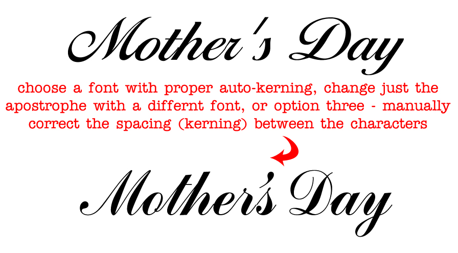
As designers we can’t shrug our shoulders and say “It’s just the way the font looks” when character spacing is off. Whether it’s between all the letters, only between a letter and a special character like an apostrophe, or it’s only the spacing between words; all of these are critical to achieve professional looking typography, and all of these ‘spacing issues’ are adjustable.
Tracking is about controlling the uniform spacing between all the letters in a piece of text, while kerning refers to the spacing between two specific letters.
Kerning – The definition:  The process of adjusting the spacing between individual characters to achieve a pleasing result.
Tracking – The definition: Where kerning adjusts the spacing between two characters, tracking adjusts the letter-spacing uniformly over a range of characters.
Do not worry about making kerning or tracking adjustments until you settle on your font choice for that given design, as each typeface demands its own attention to the adjusting of space between some or all of the characters. Such as the apostrophe in Mother’s Day.
– Sometimes the spacing between characters, may be visually pleasing, BUT the space between words and/or the spacing between letters and special characters need significant improvements.
– Adjust kerning in Photoshop (and most Adobe design software) by:
To use a font’s built-in kerning information for selected characters, select Metrics for the Kerning option in the Character panel.
To automatically adjust the spacing between selected characters based on their shapes, select Optical for the Kerning option in the Character panel.
To adjust kerning manually, place an insertion point between two characters, and set the desired value for the Kerning option in the Character panel. (Note that if a range of text is selected, you can’t manually Kern the text. Instead, use tracking.) If you work in a program which does not allow adjustments (all Adobe software and most word processing software allow for kerning), then you must choose a different font which offers more natural spacing between letters.
………………………………………….
2- Use Superscript indicators for example: Fourth = 4th not 4th
………………………………………….
3- Connect Script Characters: Make sure to properly adjust fonts which have extended lines at the end of each letter so that when kerned, the letters connect to flow smoothly from one to the next, tying the word together. When this is ignored, the typography looks almost staccato, and certainly amateurish.
………………………………………….
4- Breathing Space: Allowing ‘breathing space’ for your text within the design is critical to how your overall card will look when printed.
This means leaving a little ‘breathing room’ between the end or beginning of your lines of text and the trim line (yellow safety zone in Print Margin Preview), as well as room to breathe away from the card’s fold line.
This should also be applied to critical elements within the design. Allowing a bit of space between image elements and text not only creates better balance, but can also improve both the legibility of your text and the feel of the message are portraying on the card.
………………………………………….
5- Line Spacing: The space between lines of text is also important to the overall look and feel of your typography. Too close and it looks cramped, often becoming illegible. Too far apart – from one line to the next – causes a disconnect and changes the overall feel of your message. Leading is the space between lines of text and is generally measured from baseline to baseline of each sentence. The general rule is to allow a leading that is 2 points above the font’s height. So for example, if you are using a 10pt font then the line space (leading) should be 12pts. This can vary depending on the font – different fonts need different line spacing. For those of you who love math, line spacing should be 120–145% of the point size.
………………………………………….
6- Verse Line Breaks: Line breaks in your message, both on the card front text and your inside verse, should break to reflect natural speech patterns. Rarely, does it ever make for a professional sounding greeting card to all the words to auto-wrap inside the card.
For example THIS:
Wishing you a day
that is filled with beauty
and a year
filled with happiness. ——> correct
NOT THIS:
Wishing you a
day that is filled with
beauty and a
year filled with happiness. ——> incorrect
On card front text, sometimes you may need to recast your phrase (start over) in order to make the text read properly and work well within the design. The example on the far left leaves the viewer hanging on the ‘aaaaaa’ as if we’ve lost our train of thought completely. The middle example breaks as we would speak this phrase, with a short pause before the “a Happy Birthday”. The example on the far right is even better for this design. The message has been recast to change the verbiage and a spot was created for all the text to be housed in the same location which gives the overall card front a balanced and professional look.
 ………………………………………….
7- Choose Recipient-Friendly Fonts: Script (cursive) fonts for example are not appropriate for children under 8-years-old.
Avoid using fonts which are too rough, too ‘shaky hand looking’ in their appearance (such as this example). They are difficult to read and very amateurish – though non-cursive versions are often acceptable on cards for small children.

…………………………………………
8- Use Curly Apostrophe/Quotes: Use curly quotes (and apostrophes) which match the font characters better, look professional and are more legible. The straight quotes came from the typewriter days. In digital creation tools of today, you can always get curly quotes.
If you use a program, such as; Photoshop, go to Edit > Preferences > Type > turn Smart Quotes ‘on’ by checking the box. Not all fonts are created to respond to Smart Quotes, but many do. When the font you wish to use does not allow for curly verses straight apostrophe or quotes, then highlight just those characters and change them to a font which does support this improvement. See example above.
…………………………………………
So until next week … Learn … Create … Inspire!


