Dash of Inspiration: 10 Reasons Why Your Photos Might Not Meet Submission Guidelines
A Dash of Inspiration, A Cup of Creativity by Doreen
(Since it was a holiday weekend, Doreen asked us to run a former article – this first appeared in August 2012)
10 Reasons Why Your Photos Might Not Meet Submission Guidelines

1) Poor Lighting
Lighting can make or break a photograph, after all a photograph IS a collection of light. Harsh lighting causes washed out detail in the highlights (whites) and lens flare. Low lighting can cause color shifts, muddy blacks without detail, color noise and blurry edges due to camera shake. On camera flash often causes the a flattening of the image and can create deep unpleasing shadows. Good photographs need to look natural, lighting a photograph is understanding light sources and using them to create mood and depth. Washed out images, those which are dark or lacking in contrast (flat) or those with deep unnatural shadows are most likely not going to meet GCU’s submission guidelines.

To further explore Lighting and Contrast:
Dash of Inspiration: “Highlights & Shadows” – October 24th, 2011
“Blown Highlights” – Photography tip article by DErhardt July 2009
Dash of Inspiration: “Introduction to Contrast in Monochromatic Digital Photos” by SunAtNight
2) Poor Color
Having poor White Balance causes photographs to have ugly and unnatural color casts. In photography, whites need to be white and blacks need to be black. These color shifts can occur when taking the photograph and when scanning artwork, photos, negatives or transparencies. Correcting white balance is simple and can be done any of three ways; a) adjust white balance settings on the camera for the conditions you’re shooting under, b) adjust the color balance in post-processing software, or 3) use external filters on your camera lens prior to shooting.

To further explore Color Balance & Correction Filters:
Dash of Inspiration: “The Color of Light” posted on November 1st, 2011
“Traditional Camera Filter Recommendations” – Photography tip article by DErhardt May 2010
3) Poor Depth of Field
Understand how to use and when to manipulate Depth of Field. Shallow DOF has it’s place, but it certainly is not for every photo. Most SLR cameras have a depth of field preview, easy to use and can be quite the learning tool. Learn how and when to adjust your aperture to gain focal length. Be sure your entire subject falls within the DOF range and make conscious decisions on where the DOF begins to drop off. DOF drop that begins and ends in the wrong place within your composition and your photograph is no longer a winner.

To further explore Depth of Field and Creative Focus Techniques
“Focus on Depth of Field” – Photography tip article by DErhardt August 2009
“the Fundamentals of Focusing Techniques” – photography tip article by DErhardt October 2011
4) Not Getting the BEST shot
Learn to observe your subject before you grab the shot. The BEST shot means you choose the best subject – this is really important when shooting floral photography to name one area. Browning petals and those eaten by bugs for example are not good subjects. Position yourself to the subject and light source so that you get the best angle and best lighting on your subject. Take the time to choose the right lens for the job and to add a fill flash if necessary. Challenge yourself to show your subject at it’s BEST!

To further explore Getting the Best Shot:
“Guide to a Winning Photograph” – Photography tip article by DErhardt May 2011
“Flower Photography 101” – photography tip article by DErhardt April 2011
Dash of Inspiration: Floral Photography 101 and Beyond – posted on August 1, 2011
5) Distractions
There is an old saying in photography; “That which does not add to the photograph, detracts from photograph”. Sticks and branches, messy living rooms, poles sticking out of peoples heads – all of these are found in snapshots and take away from an otherwise well-composed photo. When composing look at every element the camera is going to capture and position yourself so that those distractions do not ruin your photograph.

6) Poor Composition
Learn the basic rule of thirds. Until you understand and can successfully apply composition rules, you are not qualified to know how to break the rules! Be aware of your horizon line when composing; if there is a body of water, buildings, street or anything which adds horizontal or vertical lines to your photograph, make sure they are straight. When looking though the viewfinder, either fill the frame with your subject or use basic composition rules to place your subject in a pleasing composition.

To further explore Composition:
Dash of Inspiration: “Better Designs = More Approvals = More Sales” – September 19th, 2011
7) Poor Motion Capture and Camera Shake
Taking photos of moving objects and/or while you are moving is a well-practiced skill. As many of you, when I’m on vacation I might grab a couple of shots out the car window, but only my scrapbook will see those images. In low light condition, use a tripod. You may think you are holding the camera still, but unless your shutter speed is well above the focal length of your lens you’ll have camera shake. Motion capture means that you are showing the motion of a moving subject, so one of three situations are considered successful capture; a) the image shows the moving subject in sharp focus (motion stopped) and the background shows indication of movement, b) the moving subject has motion blur and the background is in sharp focus, or c) stopping motion entirely so both the subject and the surroundings are in focus.

To further explore Capturing Motion:
“Motion Capture Photography” – photography tip article by DErhardt July 2010
8) Poor Flash Techniques
Using a flash is not just turning it on and allowing it to run on whatever power output the default setting of your camera, it’s knowing how to set it for the lighting conditions. Flash causes deep shadows, washed out colors and of course that horrible ‘flash eye’ effect. Learn techniques for adding ‘fill light’ or ‘bounce light’ to your images when necessary; and if you get flash eye, regardless of whether it’s red, yellow or green; learn to fix it in post-processing.

To further explore Flash Techniques:
On-Camera Flash Tips – by Digital-Photography-School
“Get the Red Out” – photography tip article by DErhardt May 2009
9) Resolution Issues
It’s important to understand the resolution your camera is recording at and/or what resolution to scan a negative or photo at in order to produce a quality 1500 x 2100 pixels image at 300 dots per inch (DPI) to meet GCU’s sizing standards. Simply resizing a photo which was recorded at 72dpi and changing it to 300dpi without modifying the pixels dimensions will cause serious resolution issues and your images will have jpg artifacts. Do your homework and don’t size images up! Remember jpgs are a compressed file type, so every time you save that image over itself, you are degrading the quality of the image! Work in an uncompressed format.

To further explore Resolution:
Dash of Inspiration: “Artifacts … The Facts” posted March 19, 2012
“Digital File Types” – photography tip article by DErhardt January 2010
10) Excessive Post-Processing
As a general rule of thumb, post-processing photographs should be that which makes minor adjustments to color, tonal values, saturation, spotting, cropping and sharpness. A heavy hand during any of these adjustments can cause a degradation in quality resulting in color noise, color banding and loss of detail to name a few. In addition, excessive use of digital filters are a sign of ‘an amateur at the wheel’. Learn how to combine ‘effects’ with a light hand and choose your subjects carefully when applying digital filtering.

To further explore Post-processing:
Dash of Inspiration: “Post-Processing Do’s and Don’ts” – posted March 5th, 2012
“From Bland to Grand” – photography tip article by Doreen Erhardt published November 2010
Share this:

Labor Day

Happy Labor Day, America!
We resume our regular posts tomorrow. In the meantime, have a great holiday.
Share this:

Critique Clinic – August 30-31 and September 1, 2013

How does it work? For three days a week (Friday-Sunday midnight), I will open the clinic to any artist who wants an honest peer review and critique of a card which gets plenty of clicks but no sales, so something’s probably not quite right, or you’ve got a new design you want to test drive, or you’re unsure about the marketability of a card. Or perhaps you’re a newbie who isn’t sure if a card is up to a marketable standard. Anyone is welcome to participate. In fact, I encourage everyone to at least look at the cards in question and read the critique comments – you may learn something. The purpose of the clinic is to help artists improve the commercial appeal and marketability of their cards.
THE RULES
- ONE card per artist only.
- Card must be intended for sale at Greeting Card Universe.
- To submit a card for critique, post a link to the card at GCU in the comments section of this clinic post. Allowances will be made if you’ve had a card declined, or made a new design you’d like advice on before submission. Give us the link where we can see the card, such as your private gallery, Flickr, Tinypic, etc. If you do give a private gallery link, be sure your private module gallery is ON. Please do not post links to your Manage Cards section – do you really want strangers tinkering with your cards? And please don’t ask us to critique a card that’s pending review – we can’t see it until it’s approved.
- Any artist is free to comment and/or give a critique of a submitted card. HOWEVER, post-and-run comments like “great card” or “you suck” will not be tolerated, nor will abuse. Criticism should be constructive, not destructive. Play nice or you will be banned.
- I also won’t tolerate temper tantrums if you decide your “artistic integrity” is being stepped on because you asked for a critique, and someone told you the photo you’re using isn’t in focus. If you can’t take honest criticism, don’t submit. Once gets you a warning; twice and you’re banned from submitting in the future.
- Artists who critique may do so by giving their opinion, posting an example of another card, or pointing the submitter to a video, on-line article, or other helpful suggestion.
- Don’t forget that artists who are giving you tips and helpful advice are volunteering their time and trouble. Be nice. A link back to their store on your website or blog is appreciated (but not mandatory).
- You are free not to take any advice offered. There’s no guarantee any card will be a bestseller, so don’t come into the clinic with unrealistic expectations.
- Rules may change as we go along and we see how things turn out, okay?
So without any further ado, I declare this week’s Critique Clinic open!
Share this:

Design Contest: Simply the Best RESULTS

The voting is over and the results are in – John H. Johnson wins our design contest with 58 votes!
Congratulations to our winner!
John, get in touch with me via the Contact Corrie link on the right side of this page and let me know which prize you’d like to receive – 5 free card credits or $10 Amazon.com gift certificate
Share this:

Font Frenzy: Discount Font Source

Today, we’re bringing you not one font, but a link to an ever changing source of discounted fonts.
My Fonts: Special Offers lists fonts on sale at the site. Some fonts are truly deeply discounted, making them very affordable. Others have a small percentage shaved off their price. As with any sales offers, there are deadlines.
As to the prices, your mileage may vary. Some fonts are just expensive, even on sale. Others are more affordable. What fonts you like and what you choose to spend is up to you.
Since the My Fonts: Special Offers page is continually updated, I usually go there once or twice a month to see what’s on sale. I’ve picked up some nice cheap fonts that way.
Below are just a couple of samples of fonts currently on sale. Good luck!


Share this:


Submitting Your Site to Search Engines: Part 1
by Cheryl Hall at Golden Jackal Card Store
How do you submit a site to search engines?
You don’t need SEO (search engine optimization) to submit your site to Google, Yahoo or Bing. It’s also free to get into the big three search engine listings. By the way, Bing powers Yahoo results (since 2013).
The best way to actually get into the top search engines is for the search engine spider to find your site through a link that is already on another website, one that Google already has in it’s index. For example, a link from a blog, forum or other website. Any link from another website will do as long as it seen as a link.
What about directory submission services to help me get a website into search engines? Of course you can submit/register your site to directories like Google, Yahoo and Bing.
Here is a list to get you started:
Submit site to Bing Webmaster Tools
How social media sites can help get your site indexed by search engines: if you already do it, then it can’t hurt!
Google have their spiders crawl over Facebook, Twitter, and Google Plus. Apparently, Bing spiders Facebook pages too (it is believed that they have an agreement with Facebook). Links on these websites often spread to other places on the web, meaning that creating a profile on social networks can help a website get into search engines.
Think long term. Search engine submission is a not a quick fix. To be successful you need to keep on top of these things in particular:
- Position your keywords in the most effective place and structure your pages correctly. (I will have more on this in future posts)
- Register with as many web directories as possible.
- Build a great site and have unique content that other websites will want to link to.
- Concentrate your efforts on these things and within a few months you’ll start to see the fruits of you labor.
I know all this can be confusing and overwhelming but just take a deep breathe and in time you will get there!
Happy submitting! f you can’t wait to read Part 2 of Submitting you site to search engines, you can read it right now.
For more helpful tips visit Golden Jackal
Share this:

Dash of Inspiration: Marketability – Photo Card Area
A Dash of Inspiration, A Cup of Creativity by Doreen
Marketability: Photo Card Area

Let’s keep this series going by heading into the last grouping of the Submission Guidelines; Marketability and next up is Photo Card Area.
MARKETABILITY: Photo Card Area
The Submission Guidelines state this: On photo card designs, the photo area should serve as the focal point of the overall design. Compositional emphasis should be on the photo, not other elements on the card. Maximize the photo size as the focal point. Specifically: Entire photo area (a single photo or multiple photos) should ideally use 1/3 to 1/2 of the card’s surface. If design is used to create multiple cards, elements should vary and be appropriate by occasion, age, relation, and gender.
A mistake many artists make is trying to ‘shove’ a photo area into an existing ‘standard’ design. Though this works occasionally, most of the time the photo card tends to look as though this was the technique used and therefore just isn’t a good photo card. Here are examples of this type of card, all of which would most likely be declined.


By: Penny Cork – This is an outstanding design, so obviously created as a well thought out photo card. It’s a perfect magazine cover.

By: ©Doreen Erhardt – A very popular holiday photo card created to give the customer a ‘year at a glance’ style for their annual season’s greetings.
Photo cards which sell well, therefore highly marketable, are those designed specifically as photo cards. The photo area and the custom text are the focal points of the design. There are some great examples below of various types of photo card styles. As always there are exceptions to the rules, in this case exceptions to the 1/3 to ½ of the card’s surface being dedicated to the photo area. Look at those examples and you can see, these were designed with ‘smaller’ photo areas in mind to compliment the overall design.
Two good examples of when breaking the 1/3 to ½ of the card’s surface actually works and all elements blend beautifully with each other to create a marketable photo card.

By: Anura Design Studio

By: Debbie Fieno
Here are some great tips:
Nuts & Bolts: Photo Cards
Blast From the Past: Tips for Photo Cards
Dash of Inspiration: Custom Front of Card Tips
Next week we’ll continue in the final group of the Submission Guidelines: MARKETABILITY and talk about Creative Use Policy. Till next week, I hope I’ve inspired you to create better Photo Cards.
For great resources & tips visit the SalonOfArt
Share this:

Critique Clinic – August 23-25, 2013
How does it work? For three days a week (Friday-Sunday midnight), I will open the clinic to any artist who wants an honest peer review and critique of a card which gets plenty of clicks but no sales, so something’s probably not quite right, or you’ve got a new design you want to test drive, or you’re unsure about the marketability of a card. Or perhaps you’re a newbie who isn’t sure if a card is up to a marketable standard. Anyone is welcome to participate. In fact, I encourage everyone to at least look at the cards in question and read the critique comments – you may learn something. The purpose of the clinic is to help artists improve the commercial appeal and marketability of their cards.
THE RULES
- ONE card per artist only.
- Card must be intended for sale at Greeting Card Universe.
- To submit a card for critique, post a link to the card at GCU in the comments section of this clinic post. Allowances will be made if you’ve had a card declined, or made a new design you’d like advice on before submission. Give us the link where we can see the card, such as your private gallery, Flickr, Tinypic, etc. If you do give a private gallery link, be sure your private module gallery is ON. Please do not post links to your Manage Cards section – do you really want strangers tinkering with your cards? And please don’t ask us to critique a card that’s pending review – we can’t see it until it’s approved.
- Any artist is free to comment and/or give a critique of a submitted card. HOWEVER, post-and-run comments like “great card” or “you suck” will not be tolerated, nor will abuse. Criticism should be constructive, not destructive. Play nice or you will be banned.
- I also won’t tolerate temper tantrums if you decide your “artistic integrity” is being stepped on because you asked for a critique, and someone told you the photo you’re using isn’t in focus. If you can’t take honest criticism, don’t submit. Once gets you a warning; twice and you’re banned from submitting in the future.
- Artists who critique may do so by giving their opinion, posting an example of another card, or pointing the submitter to a video, on-line article, or other helpful suggestion.
- Don’t forget that artists who are giving you tips and helpful advice are volunteering their time and trouble. Be nice. A link back to their store on your website or blog is appreciated (but not mandatory).
- You are free not to take any advice offered. There’s no guarantee any card will be a bestseller, so don’t come into the clinic with unrealistic expectations.
- Rules may change as we go along and we see how things turn out, okay?
So without any further ado, I declare this week’s Critique Clinic open!
Share this:

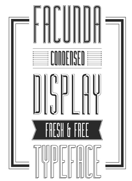
Font Frenzy: Facunda – Free!
Today’s type-alicious treat is Facunda, a versatile sans serif font family. In the download, you’ll get regular, italic, shadow, alternate, and alternate italic. The font would fit certain types of nostalgia or retro designs, but there’s enough modernity here that you could use it in combination with other fonts (like script). Best of all, the license is OK and free for commercial use. You’ll see a sample of Facunda below. Have fun!
Share this:

Design Contest: Simply the Best – VOTE!

Apologies for the delay, folks, but we’re here and we’re ready to open the voting on our Design Contest: Simply the Best!
Nominated cards are below. Click a card to see the bigger size, then return here to vote in the poll.
One vote per person. Anyone may vote, so be sure to promote your entry on social media sites like Facebook and Twitter. Voting deadline is August 27. The artist who receives the most votes will be declared the winner and receive their choice of 5 free card credits OR a $10 Amazon.com gift certificate.
Are we ready? Get set … go!
_________________________
1.  2.
2.  3.
3. 
4.  5.
5. 
6.  7.
7.  8.
8. 
9.  10.
10.  11.
11. 
12.  13.
13.  14.
14. 


