Guest Post: Fair Use and Copyright
Armed with Knowledge: Understanding Fair Use
By Guest Blogger: Sun At Night
Any artist can discover that their visual has been used without their permission or license. This can happen at any time, in any place and in any form. The organization or individual may claim that they have the right to use the images under the Fair Use doctrine. What is fair use and what does it mean?
In the U.S. the copyright laws include a limitation of use without permission or licensing of copyrighted material. The use of a reproduction of a particular work without permission of the copyright holder is allowed and not considered an infringement under the Fair Use doctrine. The use may be considered fair when it is used for educational purposes such as teaching or research. Other instances of fair use are: commentary, news, and criticism. The Fair Use doctrine applies to video, audio, text, and imagery.
Under the umbrella of fair use, libraries are able to offer photocopies of book pages. Search engines are able to offer lower quality thumbnails of images for research purposes and bloggers may post images for criticism or commentary. Teachers may incorporate images into curriculum for educational purposes. After all, where would artists be without visual examples of photography or art in the classroom? What fair use does not cover are commercial purposes.
In a real world example an artist incorporates an image from a photographer’s web site (without permission) into their blog. The image used was not pertinent to the blogger’s works of art. The blog post did not comment on the image nor was it mentioned in anyway. The image was simply incorporated for visual appeal. The blog post was simply to keep fans, customers, and patrons informed that the blogger’s new second art studio was coming along nicely. This is an advertisement promoting or marketing the new secondary studio. In this case the artist blogger is unable to claim fair use due to the advertisement being a commercial purpose.
The copyright code has four factors that are considered in determining that a use of the material in question is fair. The four factors are:
- The purpose and character of the use, including whether such use is of commercial nature or is for nonprofit educational purposes.
- The nature of the copyrighted work.
- The amount and substantiality of the portion used in relation to the copyrighted work as a whole.
- The effect of the use upon the potential market for, or value of, the copyrighted work.
The third factor above regarding the amount or portion used is not quantified by law. There are industry standards though. The rule of thumb is any copyrighted material that is used equals over 10 percent of the original may be considered too much. In the case of imagery whether it is photography or art the rule of thumb is that the total is no more than 5 images from a single artist. Online educators are given these industry standards for incorporating copyrighted material into their curriculum:
- Motion media (video) – allowable up to 10% or 3 minutes whichever is less.
- Text material – up to 10% or 1000 words whichever is less.
- Music, lyrics, music video – up to 10% but no more than 30 seconds.
- Imagery including art or photography – no more than 5 images from an artist or 15 works from a published collective work.
Other industry guidelines are time related. The most common recommendation for teachers who use copyrighted works under the Fair Use doctrine is to do so for a limited time. Online and classroom instructors are recommended to incorporate the copyrighted material into curriculum based instruction and conference presentations for a 15 day availability period. After 15 days the copyrighted material can be put in reserve or archives for 2 years. After the two year period permission from the copyright holder should be obtained. Remember these are just guidelines and can differ amongst organizations.
Artist’s Actions
Artist’s need to think about and consider fair use laws when dealing with copyright infringements. While this sounds like common sense it is now a legal consideration. Why? In 2008 the U.S. court ruled that “failure to consider fair use when sending a DMCA notice could give rise to a claim of failing to act in good faith.” (Lenz v. Universal Music Corp., 572 F. Supp 2d 1150 (N.D. Cal. 2008).)
Here are some corrective actions that artists can take when dealing with potential copyright infringements; it also ensures that the artist has done their due diligence:
- Double check licensing records. This includes verifying sales or lack of licenses with any stock agencies.
- Consider Fair Use Laws – consider any probable claims of fair use.
- Make sure that elements in question qualify for copyright.
- Check the quantity of the material in question.
- Check the WhoIs registry – discover what countries are involved. U.S. Copyright laws are only applicable in the U.S. This includes the DMCA take down notice.
- Contact the potential infringer in writing requesting the removal of the material in question. Keep documentation and obtain screen captures identifying potential infringements.
- File a DMCA Notice if needed. Only the copyright holder or a designated agent may file.
- Consult a copyright lawyer when you feel it is necessary.
Why is due diligence important when filing a DMCA notice? There are penalties for filing a false DMCA notice. Due diligence is simply taking reasonable steps to satisfy legal requirements. In relation to the good faith phrase regarding the DMCA notices it is wise to be armed with knowledge.
Additional Reading
Article from Plagiarism Today: When Not to File a DMCA Notice
Article summaries from Stanford SULAIR: Copyright and Fair Use
Copyright Duration Diagram from Public Domain Sherpa
Copyright.gov – Copyright Code Flyer – FL-102
Share this:

Design Spotlight: Vicki Ferrari

Today’s Design Spotlight is on artist Vicki Ferrari of Vicki Ferrari Photography
_________________________
 I have been taking photographs professionally since the early 1980’s, with the use of both manual SLR’s (be it film or transparency) and medium format cameras. I also worked on Hamilton Island in Queensland, Australia in the early 90’s, where I worked as the Island Photographer, having the time of my life, working with people on places like the Reef, at Whitehaven Beach and on Hayman Island.
Photography has always been my life and passion. This is demonstrated in all my work, be it a portrait or wedding photography or creative photography, art and design.
My signature style is that I have the ability to create many different artistic styles, not just one particular genre. My work has always reflected this ability but never more since the exciting discovery of digital art and design, which I found shortly after making the transition to digital photography in 2004. And loving it!
I have managed to combine my love of the Australian bush, spiritual beliefs, quotes and of the Australian Outback and this is expressed clearly in my body of work.
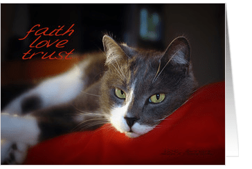
Faith, Love, Trust is a card for motivation and encouragement. The model is my lovely furry boy, Sully!! He is so purrfectly sweet but then I am biased, of course!!
Share this:

Dash of Inspiration – A Piece of the Action
A Dash of Inspiration, A Cup of Creativity by Doreen
A Piece of the Action

I saw an article on action photography related to performing arts and it inspired me . . . to inspire you! So this week we’ll chat about capturing movement in photography. For about ten years, I had the pleasurable experience of being a member of a group that offered constructive critiquing for the Photographic Society of America. We saw all types of subjects, but the ones that were usually the most disturbing were the amateur attempts at motion capture.
There are specific techniques, which are not difficult, but do require some practice to create an image like those in Angie Bowen’s Showcase of Photography in Action at Noupe.com. I saw so many photographs where the photographer would so proudly state ‘the blur is intentional, I was showing motion’, yet the entire image was blurry. This type of photograph does not show motion, a blurry photograph is nothing more than a blurry photograph. My Photography Tip for June/July of 2010 was on Motion Capture, so I’ve offered the link to that below for those of you who are interested in learning more about the techniques.
Motion Capture Photography by Doreen Erhardt
I also thought I’d offer some great examples of cards on GCU which have really well-done motion capture photographs:

This image from Sandra Rose is really well done. Notice how well she captured the movement of the puppy by keeping that cute little fur ball in sharp focus and letting the surroundings wiz by to give us the feeling of motion?
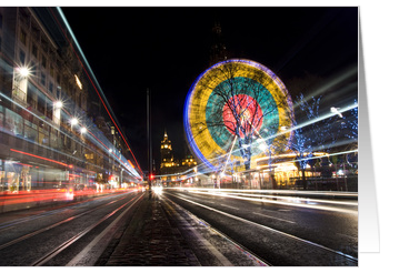
This photograph by Claire Shearer is terrific example of the Motion Blur technique I refer to in my article. The movement is shown in the lines of light created by a train or traffic moving through during exposure, yet the building in the background and those above the source of the motion remain sharply focused.
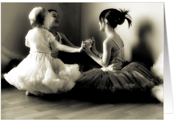
In this beautiful example by Noelle Lorraine, she’s captured the moment of these precious little girls doing ‘patty-cake’ by stopping the action. When we look at this photograph, we know the children were in motion at the time based purely on the position of their hands & bodies; and their expressions. This a a perfect example of Stopping Motion.
So, I hope that I’ve inspired some of you to try some new techniques and to better understand what a good motion capture photograph looks like!
Share this:

Critique Clinic – February 3-5, 2012

How does it work? For three days a week (Friday-Sunday midnight), I will open the clinic to any artist who wants an honest peer review and critique of a card which gets plenty of clicks but no sales, so something’s probably not quite right, or you’ve got a new design you want to test drive, or you’re unsure about the marketability of a card. Or perhaps you’re a newbie who isn’t sure if a recently submitted card is up to a marketable standard. Anyone is welcome to participate. In fact, I encourage everyone to at least look at the cards in question and read the critique comments – you may learn something. The purpose of the clinic is to help artists improve the commercial appeal and marketability of their cards.
THE RULES
- ONE card per artist only.
- Card must be for sale at Greeting Card Universe.
- We will take an unlimited number of artists, including those who have submitted recently, HOWEVER I reserve the right to close a clinic for the day if the submissions become overwhelming. If the clinic has been closed, and you submit a card, your comment will be deleted.
- To submit a card for critique, post a link to the card at GCU in the comments section of this clinic post. Allowances will be made if you’ve had a card declined, or made a new design you’d like advice on. Give us the link where we can see the card, such as your private gallery, Flickr, etc.
- Any artist is free to comment and/or give a critique of a submitted card. HOWEVER, post-and-run comments like “great card” or “you suck” will not be tolerated, nor will abuse. Criticism should be constructive, not destructive. Play nice or you will be banned.
- I also won’t tolerate temper tantrums if you decide your “artistic integrity” is being stepped on because you asked for a critique, and someone told you the photo you’re using isn’t in focus. If you can’t take honest criticism, don’t submit. Once gets you a warning; twice and you’re banned from submitting in the future.
- Artists who critique may do so by giving their opinion, posting an example of another card, or pointing the submitter to a video, on-line article, or other helpful suggestion.
- Don’t forget that artists who are giving you tips and helpful advice are volunteering their time and trouble. Be nice. A link back to their store on your website or blog is appreciated (but not mandatory).
- You are free not to take any advice offered. There’s no guarantee any card will be a bestseller, so don’t come into the clinic with unrealistic expectations.
- Rules may change as we go along and we see how things turn out, okay?
So without any further ado, I declare this week’s Critique Clinic open!
Share this:

Contest: A Little Help From My Friends

Here are the submissions for our first Design Contest/Blog Carnival mash-up called A Little Help From My Friends. We asked artists to choose another artist’s card on GCU, then make a blog post about it. Below you’ll find the master list of blog posts + the nominated cards (click on each card to get a bigger view) so you can vote on YOUR favorite. Check out the blog post, then place your vote!
Voting begins today and ends on February 7th. On February 8th, I’ll announce the winner. Both the artist who nominated the card and the artist who created the card will win a prize.
The rules are simple: only 1 vote per person. Anyone may vote, not just artists, so get out there and rustle up some voters via Facebook, Twitter, other social media sites, your blog, your website, e-mail, forums, groups, etc. Spread the word! And don’t forget to involve the artist whose card you submitted.
Good luck, everyone!
_________________________
MASTER LIST OF BLOG POSTS
- Judith Cheng nominated Studio Porto Sabbia
- Aqua Lee nominated Lauren Reeser
- Doreen Erhardt nominated Stephanie Laird
- Peggy Mundell nominated Colleen @ Great Scott Designs
- Cindy Johns nominated Ramelle Richardson
- Annie Lim nominated Judith Cheng
- Elizabeth nominated Dreaming Mind Cards
- Betsy Bush nominated Sharon Fernleaf
- Robin Chaffin nominated Barbara Schreiber
- Sharon Fernleaf nominated Betsy Bush
- Sri Devi nominated Susan Alison
- Laura J. Holman nominated Betty Matsumoto-Schuch
- TANITU nominated Betty Matsumoto-Schuch
- Robert Bulanadi nominated Makiko Kimura
NOMINATED CARDS
1.  2.
2.  3.
3.  4.
4. 
5.  6.
6.  7.
7. 
8.  9.
9.  10.
10.  11.
11. 
12.  13.
13.  14.
14. 
Share this:

A Fellow Artist Needs Your Help

A fellow GCU artist, Nikki Cutro of 13 Black Cats Designs has suffered a devastating house fire, losing not only her home and all her possessions, but also her beloved pets except one cat. You can read more about the fire here. She’s in stable condition.
Unfortunately, Nikki has no insurance and needs help. If you’d like to assist a community member in need, you can visit the Donation Page set up on her behalf.
Share this:

Design Spotlight: Laura J. Holman

Today’s Design Spotlight is on Laura J. Holman, who has a really bright and vibrant style.
___________________________
 I live in the hills of Los Angeles, not too far from the Hollywood sign. From the views of the mountains and valley, to the indigenous plants and animals, the area is rich in inspiration for any artist.
Drawing has always been a part of my life. The minute I held my first crayon I could draw. I draw from visual memory as well as from life. I knew I never wanted to be a starving fine artist, so I attended FIT ( The Fashion Institute of Technology ) in NYC. There I took a minor course in advertising design, with a major in fashion illustration. Upon graduation, after some fashion related jobs, I was hired at a large ad agency in NYC as an assistant art director where I drew many, many storyboards and ads for Clairol hair care. I was thrilled to be making a living at what I loved to do best, and at the same time learn about marketing products, the printing process, and all about typography.
Moving to Los Angeles was a big change as I continued my ad biz career as an art director, and an even bigger change came when I had my sons. I didn’t pick up a brush or pastel for years, and I started to freelance design manufacturing catalogs. I also taught art at my son’s school, and that’s when I started to think about my art again.
My first painting since college days was done in 2007. It took about three years after that painting was completed for me to feel like I had the confidence to expose my work to the world. I started a store on Zazzle in 2010, and wonderful art friends guided me to GCU a short time later.
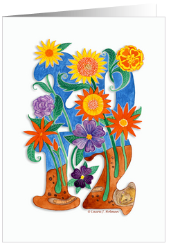
My best selling, and personal favorite card is the 2012 Happy New Year card. It’s a card, I feel, that can be used all year long as a lovely note card and reminder that this will hopefully be a better economic year for so many who have suffered job losses in 2011. I needed to portray that hope for 2012 in a card so in creating it, I thought about New Year’s resolutions and how they are really like little seeds we plant in hopes for positive changes for the New Year. From the seeds would spring forth the “flowers of hope” and knowing how popular flowers are to many card buyers, I thought combining the numbers 2012 with blooming flowers would be a winning combination. Painting the flowers vibrant colors would help further lift the spirits along with a fuzzy touch of a Burrowing Bettong and earthworm. Well… maybe not so much the worm!
I enjoy the conceptual challenge of creating a card as much as I do the execution. And then the best part is the emotional connection it makes with the buyer.
Share this:

Dash of Inspiration – Credit Where Credit is Due
A Dash of Inspiration, A Cup of Creativity by Doreen
Credit Where Credit is Due
As I refer to and re-read the new Submission Guidelines at GCU I was actually pleased to read this particular section:
Creative Use Policy: “Effective immediately all derivative works containing elements and/or photographs that are not the original creations of the submitting artist, or the reviewer feels are not the original creations of the submitting artist, must have a link(s) to the elements/photograph or thorough source description provided in the Notes to Reviewer . . . (refer to the Wiki to read the rest of this section)”
Here’s the thing – there are a tremendous amount of sites out there offering free commercial use elements for your designs; from photographs to presets and most of those places simply ask for CREDIT in lieu of payment for using their imagery. Not too much to ask for, yet I see on POD sites everywhere, people using these works and not providing credit. Sadly, the results of those who abuse the rules are that those resources are going from a free-use with credit to a pay per download such as: Photos8.com – Sam Mugraby offers wonderful photographs and all he asked for was credit, but he finally had enough of the abuse of his photographs so now we can no longer use them without purchasing. This will happen across the board if the abuse continues. Yeah, I know . . . you’re right it’s a pet peeve of mine.
So I’d like to inspire all of you using these wonderful design elements to understand what your obligations are when downloading free-use goodies.
Derivative Works/ Remix means to adapt the work not to slap it on a greeting card or t-shirt and sell it. A “derivative work” is a work based upon one or more preexisting works.
Here’s an example of Terms of Use from MorgueFile (which is pretty standard across the board):
“You are free: Remix — to adapt the work and to use this work for commercial purposes. Under the following conditions: YOU MAY NOT use the image in a stand alone basis, you can not sell, license, sub-license, rent, transfer or distribute this image exactly as it is without alteration. You may not claim ownership of this image in its original state.
So what does that mean? It means you CAN NOT download a photograph or design element and put it on a greeting card with a border and text and sell it. You can not just change the color. That would be a stand alone basis. You CAN download that photograph and paint it, use it or part of it in a digital composition made up of many different elements such as the examples in the article.
Now what about credit?
Here’s a good rule of thumb to follow: If you didn’t create it, then regardless of whether it’s in the Public Domain or from a site like MorgueFile, GIVE CREDIT. Here’s why – copyrights still apply, even in Public Domain in the sense that you can not claim it as you own; and when that artist, illustrator, photographer dies their rights transfer to their family some 70-years or so (depending on what & where). Let’s face it, we all know how family can suddenly become greedy. So, my rule of thumb is to ALWAYS give credit whenever the photograph or elements are recognizable . . . this includes Public Domain!
When working with Brushes and other presets, whether to provide credit or not will be in the license or TOU (terms of use) that come in a text file with the download or the TOU will be posted on the site. If you find neither, then don’t trust the site and don’t download. If the TOU state to credit the artist then provide it as near to where the brushes were used and as indiscreet as possible.
Here is an example of placing BRUSH credits so that they blend into the image and become part of the visual rather than drawing your eye away from the image to the credits.

and then here is the example blown up to see the credits:

Here are GCU TIPS:
You SHOULD:
- Provide a . . . courtesy of . . . statement ON THE IMAGE because that is the only place that will stay with the card. Photograph courtesy of MorgueFile for example
- Provide credit in your Artist’s Notes
- Use the Note to Reviewer Section to provide link(s) to the elements in your image which are not yours. As you’ll note in the Submission Guidelines that I quoted above, the reviewers will start returning cards to you which do not have this information.
You SHOULD NOT:
- Use a URL address on your image front or in your Artist’s Notes – this is not allowed at GCU. You can say Photo Courtesy of MorgueFile, but not Photo Courtesy of morguefile.com or www.morguefile.com
- Make your credit on the image so distracting in color, size and font that it distracts from your work.
Here is an example of placing credits so that they blend into the image and become part of the visual rather than drawing your eye away from the image to the credits:

and then here is the example blown up to see the credits:
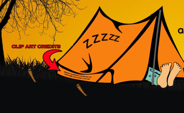
Hopefully I’ve inspired those of you who, like me, use these wonderful resources to provide credit to the owner of the image, AND to help speed up your reviews by offering the reviewers links to where you got the imagery!
Share this:

Critique Clinic – January 27-29, 2012
How does it work? For three days a week (Friday-Sunday midnight), I will open the clinic to any artist who wants an honest peer review and critique of a card which gets plenty of clicks but no sales, so something’s probably not quite right, or you’ve got a new design you want to test drive, or you’re unsure about the marketability of a card. Or perhaps you’re a newbie who isn’t sure if a recently submitted card is up to a marketable standard. Anyone is welcome to participate. In fact, I encourage everyone to at least look at the cards in question and read the critique comments – you may learn something. The purpose of the clinic is to help artists improve the commercial appeal and marketability of their cards.
THE RULES
- ONE card per artist only.
- Card must be for sale at Greeting Card Universe.
- We will take an unlimited number of artists, including those who have submitted recently, HOWEVER I reserve the right to close a clinic for the day if the submissions become overwhelming. If the clinic has been closed, and you submit a card, your comment will be deleted.
- To submit a card for critique, post a link to the card at GCU in the comments section of this clinic post. Allowances will be made if you’ve had a card declined, or a new design you’d like advice on. Just give us a link where we can see the card, such as your private gallery, Flickr, etc.
- Any artist is free to comment and/or give a critique of a submitted card. HOWEVER, post-and-run comments like “great card” or “you suck” will not be tolerated, nor will abuse. Criticism should be constructive, not destructive. Play nice or you will be banned.
- I also won’t tolerate temper tantrums if you decide your “artistic integrity” is being stepped on because you asked for a critique, and someone told you the photo you’re using isn’t in focus. If you can’t take honest criticism, don’t submit. Once gets you a warning; twice and you’re banned from submitting in the future.
- Artists who critique may do so by giving their opinion, posting an example of another card, or pointing the submitter to a video, on-line article, or other helpful suggestion.
- Don’t forget that artists who are giving you tips and helpful advice are volunteering their time and trouble. Be nice. A link back to their store on your website or blog is appreciated (but not mandatory).
- You are free not to take any advice offered. There’s no guarantee any card will be a bestseller, so don’t come into the clinic with unrealistic expectations.
- Rules may change as we go along and we see how things turn out, okay?
So without any further ado, I declare this week’s Critique Clinic open!
Share this:

Contest: A Little Help From My Friends

As I told you yesterday, today I’m announcing the start of a fun, new contest that’s a mash-up of a Design Contest and a Blog Carnival called A Little Help From My Friends. How does it work? Read on…
I want you to choose your favorite greeting card on GCU but there’s a twist: the card you choose can’t be your own. I want you to pick a card from another designer, a card you really like, a card you’d buy yourself (or have purchased in the past). Post the card to your blog (you can use the Sell This Card tool to make sure you get affiliate credit), along with a few sentences about why you like the card. Then in the Comments of THIS post, give us the link to your blog.
But wait! That’s not all! Because at the end of the deadline, I’ll collect all the cards you’ve chosen and put them up to be voted on by everybody. Whichever card receives the most votes is the winner. And guess what? I’m feeling the love, so both the artist who chose the card AND the card’s designer will win a $10 Amazon.com gift certificate or 5 free card credits!
I know the choice may be hard, but only one submission per artist, please. There are no restrictions on category or theme. And since every vote will count, I advise letting the card designer know so he or she can also promote the card and help you gather votes. Facebook, Twitter, other social media sites, e-mail groups, Forums… it’s all good.
The contest begins today. All entries must be submitted by February 1, 2012. Voting will commence on February 2nd, and be open until February 7th. On February 8th, I’ll announce the winner.
So I want everybody to get out there and get picking so we can get voting!


