Nuts and Bolts: Dedicate Yourself to the Details – Legibility

Nuts & Bolts – Dedicate Yourself to the Details – Legibility
It is often the little details that escape the artist’s eye. It is always a good idea to step away from a design that you have been meticulously working on or ask a brutally honest companion to give it a once over. The review team is certainly a fresh set of eyes and often catches tiny fixes or areas of improvement. GCU is grateful for artists who are open to collaborating with the reviewers on minor adjustments that make a big difference.
See this example with an improvement in text placement and font choice both leading to better legibility in the final design.
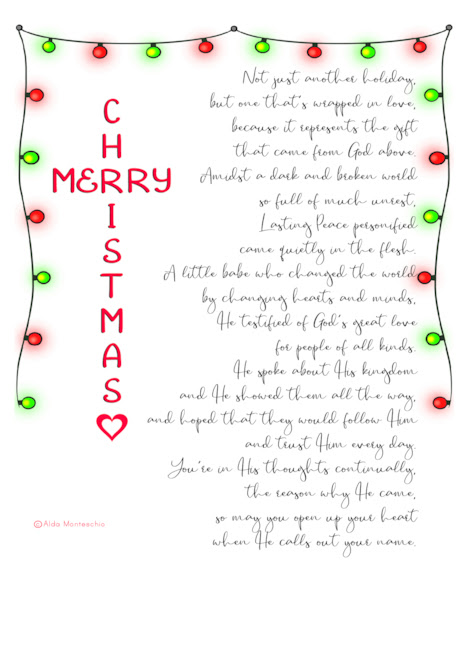
Original Image:
From the reviewer:
The text size is a little too small to be clearly legible after printing. Please increase the size/adjust for more legibility.
The blank space at the bottom of the card may also look like a print error and looks a little unfinished.
We are happy to take another look at this card if you would like to make some edits and resubmit.
Thank you.
TYPOGRAPHY – Legibility
See the GCU Blog for explanation & examples:
https://gcucommunity.com/2013/06/03/dash-of-inspiration-typography-legibility/
Resulting Image:
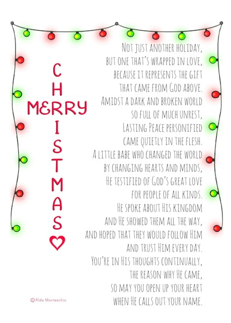
Thank you to GCU artist, Alda Monteschio of Heart Tugs, for her quick edits and receptive teamwork with our review team to create a well read submission that reads well.
Here are a few other examples of before and after improvement for cover text legibility by Angela Castillo of FairyGirlCards as well as Linda Gladman Art.
The difference is made in the details!
Mindy
GCU Community Manager


