Nuts and Bolts: Text Capitalization

Nuts & Bolts: Text Capitalization
A short phrase or one line of text on the cover of a greeting card for the most part serves as a title or an introduction to a story. It should be pleasing to the eye and work with the overall composition. Aside from typographic considerations your use of capitalization plays into the composition and balance of elements of your design. The use of upper and lower case letters can make or break your cover design. So let’s talk about capitalization.
Below are some basic tips that the Review Team will look for you to consider in your designs and will be applied on a card by card basis per the overall composition.
Sentence Case: this is what’s used in everyday writing, only capitalizing the first letter of the first word in a heading – like you would in a sentence. Proper nouns also have a capital.
For example:
My love for you is never-ending.
Title Case: This is a vexing matter, and policies vary. The usual advice is to capitalize only the “important” words. But this isn’t really very helpful. Aren’t all words in a title important?
The following rules for capitalizing titles are virtually universal.
. Capitalize the title’s first and last word.
. Capitalize all adjectives, adverbs, and nouns.
. Capitalize all pronouns (including it).
. Capitalize all verbs, including the verb to be in all forms (is, are, was, has been, etc.).
. Capitalize no, not, and the interjection O (e.g., How Long Must I Wait, O Lord?).
. Do not capitalize an article (a, an, the) unless it is first or last in the title.
. Do not capitalize a coordinating conjunction (and, or, nor, but, for, yet, so) unless it is first or last in the title.
. Do not capitalize the word to, with or without an infinitive, unless it is first or last in the title.
Otherwise, styles, methods, and opinions vary; for instance, certain short conjunctions (e.g.,as, if, how, that) are capped by some, lower cased by others.
For example:
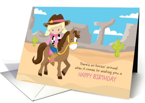
All Caps, not ideal: Grandpa, I Wish You Only The Best On Your Special Day
Upper & Lower, ideal: Grandpa, I Wish you only the Best on your Special Day
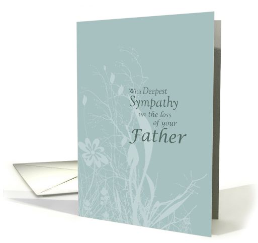
A tasteful design by Sandra Rose where the “less important” words are in lower case:
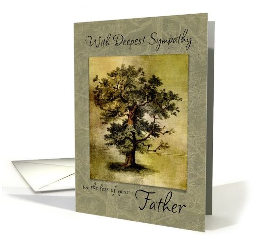
and similarly by Marcee J. Duggar:
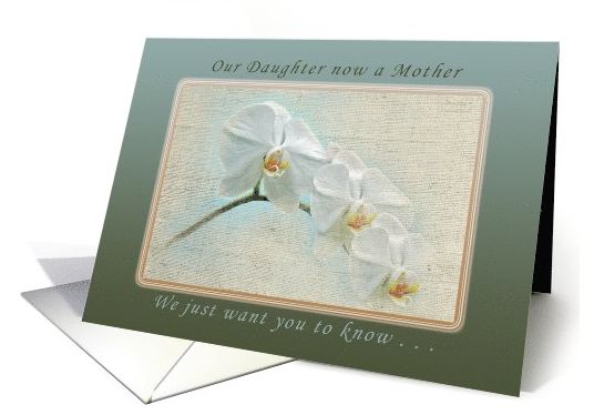
A nice example by Michael Peychich with title case in the upper text and sentence case in the lower text:
The use of ALL CAPS can add interest and emphasis but should be used with great care and intent as they can be overpowering and be perceived as SHOUTING. The font style chosen when using all caps is also a consideration on the mood that is sets. A script font, for example, does not lend itself to all capital letters.
This card by Barbara Schreiber is well done, with select words in all caps for emphasis and a light font chosen for lower case text providing balance, (here is a great post on pairing fonts):
and another nice example by Liz Van Steenburgh:
Special Note: While your Card Title provides valuable data to search engines GCU also displays them on the site. Card Titles are in fact just that, titles. Shoppers are put off by a title that looks like a jumble of keywords and therefore proper upper and lower case lettering should be used for a consistent and professional look for shoppers.
Incorrect Title: cute green cat in a box birthday for cat lover
Correct Title: Birthday for Cat Lover a Cute Green Cat in a Box
Put as much thought into your use of capitalization as you do into choosing a font style and colors. They are all important elements into your overall design. The difference is made in the details.
Share this:

Wanted New Cards: National Siblings Day / April 10
We have a new categorie that needs your attention:

At the moment there are 0 cards in this category.
We’d like you to create at least one card for these categories using the Stock Cards function (Bigstock) or your own graphic designs.
Remember, when you’re submitting your new card, add a little note about the intended category in your Notes to Reviewers. Be inventive, be clever, be creative. Go for it!
BONUS for this week only: You may set these submissions for Fast Track review
Share this:

Font Frenzy: Flowers of Camelot

The Hungry JPEG has a lovely $1 deal on offer called Flowers of Camelot by Old Market.
Flowers of Camelot includes 100 floral elements and 30 background elements! Combine the flowers and backgrounds in endless combinations. These floral elements are perfect for merchandise design, invitations, weddings, apparel, websites, branding, packaging, banners, scrapbooking, digital art creations and much more! The possibilities are endless!


What You Get:
– 100 Floral Elements PNG, approx. 1800 at widest point – 300 dpi, transparent background
– 30 Background Elements, approx. 3000 at widest point – 300 dpi, transparent background
– 2 EPS Vector Files, includes all floral elements
– 2 AI Files, includes all floral elements
Share this:

Rainbow Connection: Creativecolorschemes

Pinterest is a great source to gather information on color trends. You can search for a particular color scheme, or look at a whole collection like the one from Creativecolorschemes.


There are a whole host of colorschemes to get inspired by. Don’t grab the same 5 colors you always use in your card designs but step outside the box for a change. Happy hunting!
Share this:

Dash of Inspiration: Great Tutorials

When working with ‘digital effects’ and layering textures, it’s important to vary the intensity of the effect within your image. For example, faces and eyes especially, whether human or animal, should have a very light touch, whereas you may wish to have a background show an extreme effect. Understanding how to work with these cool techniques, when and how to apply them is a learning process and these finds today will help you get started.
CoffeeShop Photoshop/PSE Tutorial: Fine Art Texture, Selective Removal
Painting Textures – Free for CU from the Coffee Shop Blog

Notice the eyes and nose have very little textured layer showing Doreen Erhardt©
CoffeeShop Tutorial: Flower Art – Editing with Textures
How to Apply a Texture to a Selection in Photoshop by ZaniuM
The lion was added the foliage on the right was layered in, then a colored texture layer was added and removed from the lion. Doreen Erhardt©
How to Add a Texture in Illustrator
Digital Painting 101: Using Texture Brushes in Adobe Photoshop

Flower photo, added the swirl decor on the corners, then began applying texture layers and slightly removing it from the flower offered a pleasing glow for a wedding image. Doreen Erhardt©
There are lots and lots of great textures out there to try and wonderful tutorials to show you how to create with them regardless of the software you use to create with. Just remember as with all digital ‘goodies’ – never use them full strength and paint them out of areas where they make the subject difficult to see.
So until next week … Learn … Create … Inspire!
Share this:

Nuts and Bolts: Inside Verse & Unsupported Characters


Share this:

Wanted New Cards: Congratulations Hajj / Umrah
We have a category that needs your attention:
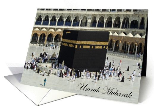
At the moment there are only 3 cards in this category.
We’d like you to create at least one card for these categories using the Stock Cards function (Bigstock) or your own graphic designs.
Remember, when you’re submitting your new card, add a little note about the intended category in your Notes to Reviewers. Be inventive, be clever, be creative. Go for it!
Share this:

Dash of Inspiration: Fonts & Freebies

This weeks’ Dash of Inspiration is short and very sweet. I found some wonderful specials on fonts and a few freebies too I wanted to share.
These fonts from Hungry JPEG are $1.00 right now and though they state they come with a Commercial Use License, but remember it’s YOUR JOB as the person paying for the font and using the font to make sure before sticking them in your shopping cart.
Also, be aware that you should read about each font, as some may require specific software and/or know how to access the swash and glyph additions.
Hedgehog By Pollem.Co

Image courtesy of The Hungry JPEG
Cinderella Script By Moriztype

Image courtesy of The Hungry JPEG
Reckless Brush By Spasibenko Art

Image courtesy of The Hungry JPEG
Khanza Script By Bonjour Type

Image courtesy of The Hungry JPEG
Matthew Jason By Decavantona

Image courtesy of The Hungry JPEG
WOW! What a great way to spend FIVE BUCKS!
Okay for those of you who want FREE fonts with a CU license, check out these:
BlowBrush Font Made by thizizraz

Genome Font Made by Hanken Design Co.

Please use the following font sparingly. This is an impact font and you should not use it to write more than one or two words in a design.
Laff Riot NF Font Made by Nick Curtis

So until next week … Learn … Create … Inspire!
Remember to get those March Dash of Inspiration Design Challenge entries in!
Share this:

Nuts and Bolts: Superscript & Ordinal Numbers


Share this:

Wanted New Cards: Letter of Recommendation / Reference
We have a category that needs your attention:
At the moment there are only 3 cards in this category.
We’d like you to create at least one card for these categories using the Stock Cards function (Bigstock) or your own graphic designs.
Remember, when you’re submitting your new card, add a little note about the intended category in your Notes to Reviewers. Be inventive, be clever, be creative. Go for it!


