Inspiration Station: 2014 Greeting Card Trends


By taking inspiration from growing trends, artists can tailor their designs to suit emerging markets – in other words, give your cards even more commercial appeal by giving shoppers what they want to buy.
Stationary Trends on-line magazine has an interesting article you should read – Market Style Update: The Stroke of a Pen. You’ll find food for thought here including wedding trends. Their e-newsletter has a lot of good information as well. We recommend checking out the site including the archives.
For more creative ideas, visit CardMaker magazine on-line. The Editor’s Blog is frequently updated with lots of pictures letting you in on the latest in handmade cards – a great source of inspiration.
Have fun and get inspired for 2014!
Share this:

Dash of Inspiration: Vertical Text Etiquette
A Dash of Inspiration, A Cup of Creativity by Doreen
Vertical Text Etiquette

Today I realized there were two areas of typography we have not touched on yet, one of them is vertical text. How to use it on greeting card images while still pulling off a professional design that will hold strong in the public marketplace. There are some really simply things to avoid, many sadly are seen prominently on old designs at GCU prior to the implementation of their submission guidelines.
When creating vertical text, keep these thoughts in mind:
- Never use script fonts, they are illegible.
- Never use italic.
- Letters are designed to sit side by side not on top of one another, therefore mismatched spacing and alignment causes will create readability problems.
- Never use lower case letters, these are awkward because the ascender and descenders make the spacing appear uneven and the varied size of the characters create the visual of a stack which looks precarious.
- Don’t overdo it. As with all typography ‘effects’ a little goes a long way. Do not create multiple lines of vertical text, or even multiple words on the same line.
To create vertical text as an accent in your design following these simple tips:
- Always use upper case letters.
- Choose a block style font for the best chance at having it look stacked and spaced evenly.
- Only choose one word to feature as vertical text unless you use the rotation method.
- Avoid vertical text all together by choosing a more professional look which is to simply rotate your text rather than stacking it.
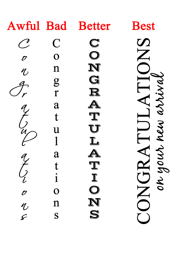
If you have fallen victim to this poor typography choice, you may want to go fix those old cards on GCU and bring them up to current standards which will meet the submission guidelines.
Next week we’ll talk about text alignment. So, until then … Learn … Create … Inspire!
Share this:

Critique Clinic – May 3-4, 2014

How does it work? For three days a week (Friday-Sunday midnight), I will open the clinic to any artist who wants an honest peer review and critique of a card which gets plenty of clicks but no sales, so something’s probably not quite right, or you’ve got a new design you want to test drive, or you’re unsure about the marketability of a card. Or perhaps you’re a newbie who isn’t sure if a card is up to a marketable standard. Anyone is welcome to participate. In fact, I encourage everyone to at least look at the cards in question and read the critique comments – you may learn something. The purpose of the clinic is to help artists improve the commercial appeal and marketability of their cards.
THE RULES
- ONE card per artist only.
- Card must be intended for sale at Greeting Card Universe.
- To submit a card for critique, post a link to the card at GCU in the comments section of this clinic post. Allowances will be made if you’ve had a card declined, or made a new design you’d like advice on before submission. Give us the link where we can see the card, such as your private gallery, Flickr, Tinypic, etc. If you do give a private gallery link, be sure your private module gallery is ON. Please do not post links to your Manage Cards section – do you really want strangers tinkering with your cards? And please don’t ask us to critique a card that’s pending review – we can’t see it until it’s approved.
- Any artist is free to comment and/or give a critique of a submitted card. HOWEVER, post-and-run comments like “great card” or “you suck” will not be tolerated, nor will abuse. Criticism should be constructive, not destructive. Play nice or you will be banned.
- I also won’t tolerate temper tantrums if you decide your “artistic integrity” is being stepped on because you asked for a critique, and someone told you the photo you’re using isn’t in focus. If you can’t take honest criticism, don’t submit. Once gets you a warning; twice and you’re banned from submitting in the future.
- Artists who critique may do so by giving their opinion, posting an example of another card, or pointing the submitter to a video, on-line article, or other helpful suggestion.
- Don’t forget that artists who are giving you tips and helpful advice are volunteering their time and trouble. Be nice. A link back to their store on your website or blog is appreciated (but not mandatory).
- You are free not to take any advice offered. There’s no guarantee any card will be a bestseller, so don’t come into the clinic with unrealistic expectations.
- Rules may change as we go along and we see how things turn out, okay?
So without any further ado, I declare this week’s Critique Clinic open!
Share this:

Nuts and Bolts: Don’t Fall Into These Traps!

Don’t Fall Into These Traps!
The Do’s and Don’ts of Greeting Card Design
Designing greeting cards is a lot more than a hobby. It’s hard work. You not only have to consider the actual design, whether you’re working with a photograph or an illustration, you also have to pair it with the right words. Overcoming these challenges isn’t easy, but with practice and by keeping certain things in mind, you will be making marketable, commercially appealing cards.
Here are the Do’s and Don’ts when it comes to designing greeting cards.
- Do Follow the Rules: GCU isn’t like other POD sites. Their team reviews your uploaded designs to ensure the cards meet their submission guidelines. So make sure you understand these guidelines before you begin or you’ll be inviting a lot of needless frustration. You’ll find lots of helpful articles with examples right here on this Community blog.
- Do Decide the Right Category First: A big mistake made by a lot of GCU artists, especially newbies, is trying to shoehorn an existing design into a category it isn’t suited for. Instead, choose the category first, then design the card to fit.
- Do Keep the Recipient In Mind: When designing your card, put yourself in the place of the intended recipient. Will a six-year old really appreciate gloomy colors and a serious message? Nope. Will someone who’s lost a loved one appreciate bright colors and a cheerful message? Nope. Your design and text must reflect the intended occasion.
- Do Make the Image and Text Relevant to Each Other: Let’s say you have a lovely photo of an elephant with a clown hat on its head. Ask yourself – is this the right picture to use on a sympathy card? Probably not. Ensure whatever image you choose is appropriate for it’s intended category and recipient.
- Don’t Forget the Inside Verse: Some artists prefer blank cards. That’s fine. However, by far the majority of shoppers want cards with inside verse. Remember a card is a personal communication between two people. Adding inside verse will make your cards a lot more appealing. A really good verse makes the shopper feel like you’ve looked inside their heart and expressed how they feel perfectly. If you need help, here’s a couple of articles: Nuts & Bolts: Front of Card Text and Nuts & Bolts: Inside Verse. For help writing humorous greeting cards: Nuts & Bolts: Writing Funny Greeting Cards.
- Do Avoid These Writing Pitfalls: Don’t rely on cliches unless you’re putting a spin. Don’t be insulting or offensive (unless that’s your goal, in which case, your cards will appeal to a somewhat limited market). Don’t be overly sentimental – make your verse sincere. Don’t be overly formal unless required (for example, a formal wedding announcement) and do mind your grammar, punctuation and spelling.
By applying what you’ve learned about designing greeting cards, you’ll be making better cards in no time!
Share this:

Tips and Tricks: Practical Typography + New Font

Typography is an important aspect of greeting card design. Inexperienced artists may not realize there are rules. The rules exist for good reasons. Here’s an excellent primer: Butterick’s Practical Typography. This site will give you a crash course in typography that will not only help you design more marketable cards, but assist you in avoiding Declines and Return for Edits.
As a bonus, here’s a font that’s on sale and practically free right now: Amorie comes in a number of weights, italic, bold, etc. Each one is only $4 – a real bargain! Pick up one or two to use in your work. Amorie is a trendy new “skinny” font. See an example below of Amorie Modella Light.

Share this:

Design Spotlight: Jason “Jay” Nocera

Our Design Spotlight falls today on Jason Nocera, a talented and funny guy who joined GCU as a new artist in February of this year – thanks, Jason!
_________________________

I am a full-time, professional cartoonist. My specialty is creating custom, personalized comic strips and comic pages for Anniversary gifts, Birthday gifts, and of course “Super” Dads for Father’s Day. As I work in my studio on other people’s gifts, I always make sure to draw personalized cards for my wife and my daughter. My wife has always said that I should try to market the cards I draw for her, but the cards always dealt with our life and are very personal. I didn’t feel that they had a mass appeal.
This past year, my six year old daughter started to find the humor in knock-knock jokes. The first one I told her was common and very simple, but always makes her laugh: “Knock, Knock”, “Who’s there?” “Boo.” “Boo who?” “Awww.. don’t cry!”
It didn’t take long for my daughter to ask for more and more knock-knock jokes and my repertoire slowly grew. Most days she says, “Dad, tell me a knock-knock joke… and make sure it’s not one I heard before!” It’s become quite a challenge but I love making her laugh!
This past February, I made time (as always) to draw a card for my wife and daughter amidst the custom Valentine’s Day comic pages I was creating. I thought it would be great to draw a knock-knock joke card for my daughter. I used “Knock, Knock” “Who’s there?” “Olive” “Olive who?” “Olive you!” and drew a funny cartoon olive kissing my daughter at the end. She loved it! After I saw her reaction, it finally clicked. I could do knock-knock joke cards featuring my silly cartoons!
I’ve been uploading them on GCU ever since.
You can also visit my website, Niche Cartoons, follow me on Twitter, or “like” me on Facebook
Share this:

Tips and Tricks: Google Analytics
Some artists have asked about Google Analytics as a way to possibly help them get a better handle on their SEO and marketing. We found a great video on MakeUseOf.com (a handy website) which explains Google Analytics for beginners and should clear up some of the mystery.
This is especially useful for those artists who own their own websites.
Google Analytics 101 (video)
Here’s a more advanced tutorial for those who already familiar with GA.
Google Analytics Custom Reports (video)
Whether you can use Google Analytics on your GCU storefront isn’t known to me for sure. Anybody out there actually doing it? If so, please leave a comment!
Edit: We’ve heard from Shaun (GCU’s technical guru) who informs us that Google Analytics won’t work on your storefronts and should not be added. GCU has already set up GA site-wide.
Share this:

Dash of Inspiration: Improving Tonal Values
A Dash of Inspiration, A Cup of Creativity by Doreen
Improving Tonal Values
There are so many things which effect the registered tonal values when taking photographs, and I’ve showed you over the years, weak tonal values can make or break an image – in other words, can be the difference between marketable and a decline.
When you choose photographs for your cards, remember landscapes, sunsets, ocean and flower photos are a dime a dozen – there are thousands being submitted every week. If your photograph does not have visual impact; meaning amazing light, saturation, unique/pleasing composition, and strong tonal values – AND speak clearly and directly to the category by tying the image and category together through your verse, your card will likely be declined.
Here are some tips for achieving rich, beautiful tonal values in your photographic submissions.
- Get to know you camera – intimately – What is it capable of? How does it see light under various conditions? Test, test, test! Make adjustments to exposure, white balance, and auto-bracketing. Knowing your camera this ‘intimately’ will allow you to make on-the-spot setting corrections to adjust for environmental changes.
- Photographers should try to avoid outdoor photo shoots between the hours of 10:00 and 2:00 pm. Unless the weather is overcast, or you can shoot your entire subject in solid shade.
- Identify the ‘color of light’ you are shooting in and adjust accordingly for best tonal values.
- Use filters on your camera lens – know when and how to use them to improve lighting conditions and increase depth in your photos.
- Learn to recognize flat contrast so you can judge whether your photo is marketable or can be saved in post-processing.
- Have access to non-destructive post-processing software made for the photographer, such as; Photoshop, Camera Raw, Lightroom, Perfect Photo Suite, Nik Software to name a few – And know how to use the software to your advantage, while avoiding over-processing.
Here are some of great tutorials I ran across this week:
Improving Image Tone With Levels In Photoshop from Photoshop Essentials
An Easy Way To Find Neutral Gray In A Photo With Photoshop from Photoshop Essentials
Comparing The Levels And Curves Adjustments In Photoshop from Photoshop Essential
So, until next week … Learn … Create … Inspire!

Share this:

Critique Clinic – April 25-27, 2014
How does it work? For three days a week (Friday-Sunday midnight), I will open the clinic to any artist who wants an honest peer review and critique of a card which gets plenty of clicks but no sales, so something’s probably not quite right, or you’ve got a new design you want to test drive, or you’re unsure about the marketability of a card. Or perhaps you’re a newbie who isn’t sure if a card is up to a marketable standard. Anyone is welcome to participate. In fact, I encourage everyone to at least look at the cards in question and read the critique comments – you may learn something. The purpose of the clinic is to help artists improve the commercial appeal and marketability of their cards.
THE RULES
- ONE card per artist only.
- Card must be intended for sale at Greeting Card Universe.
- To submit a card for critique, post a link to the card at GCU in the comments section of this clinic post. Allowances will be made if you’ve had a card declined, or made a new design you’d like advice on before submission. Give us the link where we can see the card, such as your private gallery, Flickr, Tinypic, etc. If you do give a private gallery link, be sure your private module gallery is ON. Please do not post links to your Manage Cards section – do you really want strangers tinkering with your cards? And please don’t ask us to critique a card that’s pending review – we can’t see it until it’s approved.
- Any artist is free to comment and/or give a critique of a submitted card. HOWEVER, post-and-run comments like “great card” or “you suck” will not be tolerated, nor will abuse. Criticism should be constructive, not destructive. Play nice or you will be banned.
- I also won’t tolerate temper tantrums if you decide your “artistic integrity” is being stepped on because you asked for a critique, and someone told you the photo you’re using isn’t in focus. If you can’t take honest criticism, don’t submit. Once gets you a warning; twice and you’re banned from submitting in the future.
- Artists who critique may do so by giving their opinion, posting an example of another card, or pointing the submitter to a video, on-line article, or other helpful suggestion.
- Don’t forget that artists who are giving you tips and helpful advice are volunteering their time and trouble. Be nice. A link back to their store on your website or blog is appreciated (but not mandatory).
- You are free not to take any advice offered. There’s no guarantee any card will be a bestseller, so don’t come into the clinic with unrealistic expectations.
- Rules may change as we go along and we see how things turn out, okay?
So without any further ado, I declare this week’s Critique Clinic open!
Share this:

Inspiration Station: Card Ideas for 2014
![]()
Pinterest gives great visual inspiration to artists looking for ideas to fire up their imaginations when designing greeting cards. Quite often, you’ll find hand made cards instead of the kind found in retail shops. That’s actually a good thing. Mainstream greeting card publishers have to work months ahead of a holiday, where hand made card makers can adopt trends at the spur of the moment.
Here are some boards you can visit right now.
Cardmaking Ideas
Offers great examples of hand made cards that’ll not only inspire you, but you’ll glean information on color schemes and compositions, too.
Love Card Ideas
A board devoted to love and romance cards. Some of these are very sweet. Get inspired for categories in love/romance, anniversary, and of course, Valentine’s Day.
Stampin’ Up Cards
The company makes rubber stamps and stencils for the hand made card market. These examples will really give you understanding into what’s hot right now.
Penny Black
Another stamp company. This board contains the color illustrations of their cute designs.
Feel free to further explore Pinterest and discover those hidden gems that will inspire your work!


