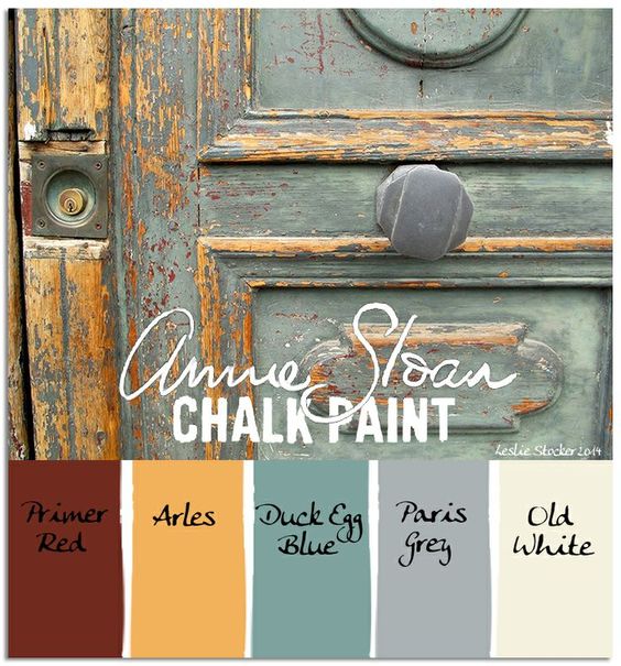
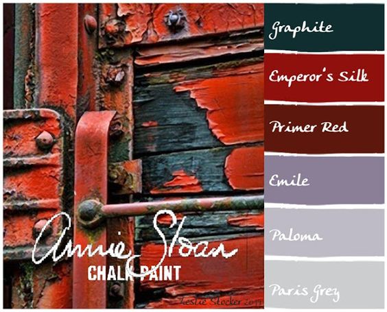
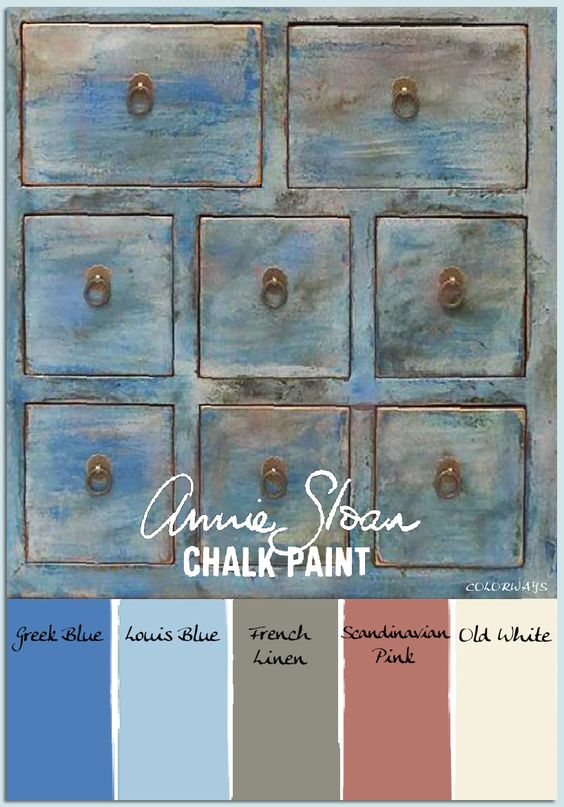
Rainbow Connection: soft Chalk Paint Colorschemes.


Nuts and Bolts: Artist Interview Tammy Moody.


GCU Community Manager
Share this:

Wanted New Cards: Mother’s Day from Heaven

We’d like you to create at least one card for these categories using the Stock Cards function (Bigstock) or your own graphic designs.
Remember, when you’re submitting your new card, add a little note about the intended category in your Notes to Reviewers. Be inventive, be clever, be creative. Go for it!
Share this:

Dash of Inspiration: Typography the “Golden Rules”
A Dash of Inspiration, A Cup of Creativity by Doreen
 There are some basic rules and important aspects of typography, we’ll refer to them here as the ‘Golden Rules’, which span the written word industries; regardless of whether it’s newspaper, magazine, or greeting cards. As designers working in the written word, it’s important that we are not only familiar with, but become experienced in applying these ‘rules’ to our own greeting card designs.
GCU will not accept cards which are serious offenders of ignoring these basic guidelines, as the result is simply not a professional looking greeting card. Typography is not an ‘after-thought’ that you slap on an image and call it a greeting card. Your text is a critical design element and should look as though it’s addition was well thought out. Follow these ‘Golden Rules’ and not only will your typography have a much better chance at being approved by the GCU Review Team, but you will have significantly improved the marketability of your card.
………………………………………….
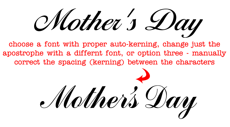
1- Character Spacing
As designers we can’t shrug our shoulders and say “It’s just the way the font looks” when character spacing is off. Whether it’s between all the letters, only between a letter and a special character like an apostrophe, or it’s only the spacing between words; all of these are critical to achieve professional looking typography, and all of these ‘spacing issues’ are adjustable.
Tracking is about controlling the uniform spacing between all the letters in a piece of text, while kerning refers to the spacing between two specific letters.
Kerning – The definition:  The process of adjusting the spacing between individual characters to achieve a pleasing result.
Tracking – The definition: Where kerning adjusts the spacing between two characters, tracking adjusts the letter-spacing uniformly over a range of characters.
Do not worry about making kerning or tracking adjustments until you settle on your font choice for that given design, as each typeface demands its own attention to the adjusting of space between some or all of the characters. Such as the apostrophe in Mother’s Day.
– Sometimes the spacing between characters, may be visually pleasing, BUT the space between words and/or the spacing between letters and special characters need significant improvements.
– Adjust kerning in Photoshop (and most Adobe design software) by:
To use a font’s built-in kerning information for selected characters, select Metrics for the Kerning option in the Character panel.
To automatically adjust the spacing between selected characters based on their shapes, select Optical for the Kerning option in the Character panel.
To adjust kerning manually, place an insertion point between two characters, and set the desired value for the Kerning option in the Character panel. (Note that if a range of text is selected, you can’t manually Kern the text. Instead, use tracking.) If you work in a program which does not allow adjustments (all Adobe software and most word processing software allow for kerning), then you must choose a different font which offers more natural spacing between letters.
………………………………………….
2- Use Superscript indicators for example: Fourth = 4th not 4th
………………………………………….
3- Connect Script Characters: Make sure to properly adjust fonts which have extended lines at the end of each letter so that when kerned, the letters connect to flow smoothly from one to the next, tying the word together. When this is ignored, the typography looks almost staccato, and certainly amateurish.
………………………………………….
4- Breathing Space: Allowing ‘breathing space’ for your text within the design is critical to how your overall card will look when printed.
This means leaving a little ‘breathing room’ between the end or beginning of your lines of text and the trim line (yellow safety zone in Print Margin Preview), as well as room to breathe away from the card’s fold line.
This should also be applied to critical elements within the design. Allowing a bit of space between image elements and text not only creates better balance, but can also improve both the legibility of your text and the feel of the message are portraying on the card.
………………………………………….
5- Line Spacing: The space between lines of text is also important to the overall look and feel of your typography. Too close and it looks cramped, often becoming illegible. Too far apart – from one line to the next – causes a disconnect and changes the overall feel of your message. Leading is the space between lines of text and is generally measured from baseline to baseline of each sentence. The general rule is to allow a leading that is 2 points above the font’s height. So for example, if you are using a 10pt font then the line space (leading) should be 12pts. This can vary depending on the font – different fonts need different line spacing. For those of you who love math, line spacing should be 120–145% of the point size.
………………………………………….
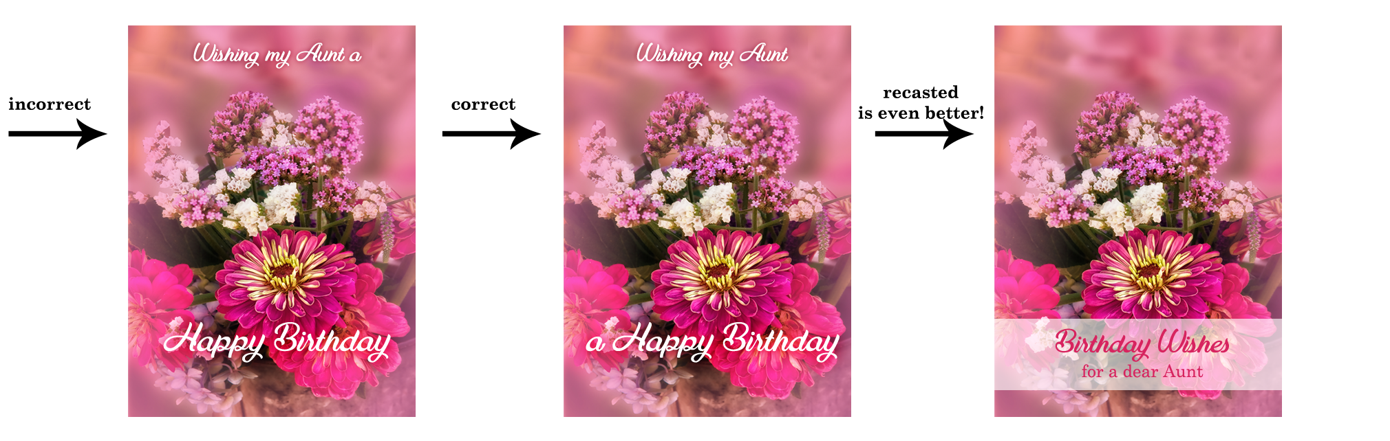
6- Verse Line Breaks: Line breaks in your message, both on the card front text and your inside verse, should break to reflect natural speech patterns. Rarely, does it ever make for a professional sounding greeting card to all the words to auto-wrap inside the card.
For example THIS:
Wishing you a day
that is filled with beauty
and a year
filled with happiness. ——> correct
NOT THIS:
Wishing you a
day that is filled with
beauty and a
year filled with happiness. ——> incorrect
On card front text, sometimes you may need to recast your phrase (start over) in order to make the text read properly and work well within the design. The example on the far left leaves the viewer hanging on the ‘aaaaaa’ as if we’ve lost our train of thought completely. The middle example breaks as we would speak this phrase, with a short pause before the “a Happy Birthday”. The example on the far right is even better for this design. The message has been recast to change the verbiage and a spot was created for all the text to be housed in the same location which gives the overall card front a balanced and professional look.
 ………………………………………….
7- Choose Recipient-Friendly Fonts: Script (cursive) fonts for example are not appropriate for children under 8-years-old.
Avoid using fonts which are too rough, too ‘shaky hand looking’ in their appearance (such as this example). They are difficult to read and very amateurish – though non-cursive versions are often acceptable on cards for small children.

…………………………………………
8- Use Curly Apostrophe/Quotes: Use curly quotes (and apostrophes) which match the font characters better, look professional and are more legible. The straight quotes came from the typewriter days. In digital creation tools of today, you can always get curly quotes.
If you use a program, such as; Photoshop, go to Edit > Preferences > Type > turn Smart Quotes ‘on’ by checking the box. Not all fonts are created to respond to Smart Quotes, but many do. When the font you wish to use does not allow for curly verses straight apostrophe or quotes, then highlight just those characters and change them to a font which does support this improvement. See example above.
…………………………………………
So until next week … Learn … Create … Inspire!
Share this:

Nuts and Bolts: Graduation 2017 to 2018
GCU Community Manager
Share this:

Dash of Inspiration: March 2018 Design Challenge

Well it seems winter has finally arrived in California, so I offer this month a warmer climate of thought to inspire your designs this month.
……………………………………………………………
Theme: Beach Life
Requirements:
- Beach theme must be the visual focus in your imagery and message.
- Write your own verse/message, be creative and write a message that clearly speaks to your imagery, occasion and recipient.
- Blank verse will not be considered for entry in this challenge.
……………………………………………………………
Entry Deadline: Saturday, March 31st
……………………………………………………………
How to Enter: Post the PID (card number) and the URL (public storefront link – please WAIT for the card to be available in the public marketplace, please DO NOT post a link to your Manage Cards area) as a post in the challenge blog. We’ll forward your entry to the jury.
……………………………………………………………….
Category:
Choose from any number of Beach/Coastal themed categories.
…………………………………………………………….
Rules:
- Submission must meet GCU’s Submission Guidelines and be Approved through the usual Review Cycle– Fast Track your submission with this in the Notes to Reviewer: March Design Challenge Submission here is the link to the blog post: (include THIS blog post URL)
- Only ONE card per artist per challenge.
- Submissions must be NEW, no existing designs.
- Your entry must meet the Challenge Requirements and Theme or it will not be included in the challenge.
- Stock Card Creations entries will not be accepted.
- Your designs should differ from those already offered in the category of your choice to offer shoppers a variety of choices, not more of the same.
……………………………………………………………………
BLIND Judging: We hope each of you enters every month. Entries are submitted anonymously for judging by the GCU Challenge Jury which means that before and during the challenge, judges do not have any way of knowing what artist is behind each entry. This eliminates any and all concerns with ‘favoritism’. Results will post on the Community Blog. The jury will judge the entries on the following criteria:
- How well the card meets the Challenge Requirements and Theme.
- How well the card speaks to the Category the artist chooses for the card submission.
- Creativity, Execution and Marketability.
……………………………………………………………………
Winners: 1st Place:
- The winning designer’s card and store will be featured on the GCU Public Blog – the blog which customers view and follow.
- As well as featured on the GCU Public Facebook Page – nearly 56,000 followers, now THAT’S exposure!
- The winning card will be Design of the Day following the announcement of the winners (within 48-hours).
EXCEPTION: Horizontal (landscape) cards may not be featured as DOD due to GCU Home Page space restrictions. In these cases, GCU will choose a different vertically oriented card from your store to feature as DOD. Thank you for your understanding and apologies for this limitation.
- The winning card will be added to the Greeting Card Universe Design Challenge Winners Pinterest Board – currently GCU’s Pinterest Page followers: 2K!
- The winning card, should the artist choose, may be referenced in a new series by the winning artist and he/she may Fast Track all cards in the new series (being sure to give the Challenge URL and winning card PID in your Notes to Reviewer for each card in this series).
- Winning card will be included in a marketing email to over 100,000 customers!
- NEW starting this month, GCU will create a Meet the Team board for the winning artist under the Pinterest GCU account where the winning artist will be able to pin and promote her own storefront and all that makes them a unique card designer and one of GCU’s artistic community team member.
-
Winning card will be posted on GCU’s Instagram with 2,000 followers and counting!
- GCU will create a Meet the Team board for the winning artist under the Pinterest GCU account where the winning artist will be able to pin and promote her own storefront and all that makes them a unique card designer and one of GCU’s artistic community team member.
2nd Place:
- Your submission will be Design of the Day the following week of announcing the Challenge winners (within 7-days).
EXCEPTION: Horizontal (landscape) cards may not be featured as DOD due to GCU Home Page space restrictions. In these cases, GCU will choose a different vertically oriented card from your store to feature as DOD. Thank you for your understanding and apologies for this limitation.
- Your card will be added to the Greeting Card Universe Design Challenge Winners Pinterest Board.
- Winning card will be included in a marketing email to over 100,000 customers!
-
Winning card will be posted on GCU’s Instagram with 2,000 followers and counting!
………………………………………………………………………
Tips:
Check out these tips, tricks, freebies, and tutorials from our own GCU Community Blog which might be helpful in this month’s Challenge.
- Tips and Tricks: Card Designer Checklist
- Nuts and Bolts: How to Write Greeting Card Verse
- Nuts and Bolts: The Right Image
- Dash of Inspiration: Getting the Most out of Photographs
………………………………………………………………………

by Doreen Erhardt Beach Bum Birthday

by Doreen Erhardt Seas the Day Birthday
Be inspired to create and learn something new!
Share this:

Wanted New Cards: Easter for Adult Grandchildren
We’d like you to create at least one card for these categories using the Stock Cards function (Bigstock) or your own graphic designs.
Share this:

Rainbow Connection: 2018 Wedding Color Trends

Artists who create wedding cards in GCU’s many categories may want to refresh older designs or make new cards taking advantage of trendy colors predicted for 2018. Here are a couple of samples of colors that will be very hot next year with brides. To see all 10 Trending Wedding Color Schemes go here


Share this:

Nuts and Bolts: PayPal Payment Method

GCU Community Manager
Share this:

Wanted New Cards: Thinking of You Bereaved.

These are NOT sympathy cards but general thinking of you cards for someone who is grieving the loss of a loved one, no matter how much time has passed. These are also NOT holiday or occasion specific cards as those are served by categories like Holidays >> Christmas >> In Remembrance.
We’d like you to create at least one card for these categories using the Stock Cards function (Bigstock) or your own graphic designs.
Remember, when you’re submitting your new card, add a little note about the intended category in your Notes to Reviewers. Be inventive, be clever, be creative. Go for it!


