Rainbow Connection: Color Through the Decades I

1880s – 1910s – As a counter trend to the excesses of the Victorian era the Arts & Crafts movement embodied honesty in craftsmanship, celebrating the joys of nature and hearth and home with colors that range from simple off whites to rich earth tones.


1920s – The Jazz Age – wall colors were generally light neutrals and greys with accessories and accents in vibrant colors like Chinese Red and Blue Peacock.


1930s and 1940s – The Bauhaus inspired modern movement and streamlined design were making an impact. Interior colors of the time were soft and dusty with creamy yellows, blued grays, soft pinks and accents in deep forest green and burgundy.


1950s – The exuberant post war boom was a mix of styles with mid-century modern and Scandinavian influences making the most impact. Pastels are the norm with pink and turquoise appliances adorning the kitchen and laundry room. Lilac and Chartreuse are very popular.


Share this:

Nuts and Bolts: Orientation Considerations Reverse Image


Share this:

Wanted New Cards: Capitol Insurrection Remembrance Day
Wanted Cards – Capitol Insurrection Remembrance Day
Too much to say about a single day, January 6, 2021, shrouded in heated emotions and opinions across the board. No matter where you stand politically, it is a day that is now branded in American history and will become a day of remembrance.
Please consider submitting cards for this new category here:
Holidays >> Capitol Insurrection Remembrance Day / Jan 6
We’d like you to create at least one card for these categories using the Stock Cards function (Bigstock) or your own graphic designs. Remember, when you’re submitting your new stock card, add a little note about the intended category in your Notes to Reviewers.
Be inventive, be clever, be creative. Go for it!
Share this:

Freebie Wednesday: Free Rainbow Unicorns
Rainbow Unicorns!
This pack of cute watercolor graphics are perfect for adorable designs! With watercolor elements and patterns, this is sure to make any designs cute!
This stylish freebie is brought to you by Shark&Croc co! Only available for at the Hungry Jpeg for a week!


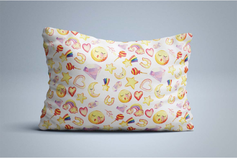
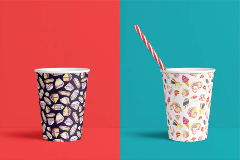
This product comes with a commercial license.
Share this:

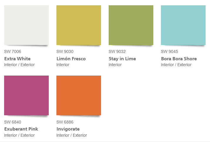
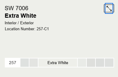
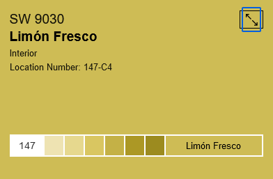
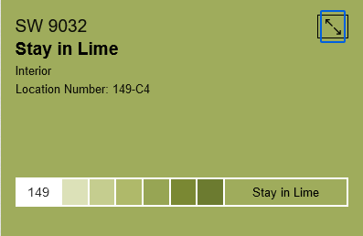
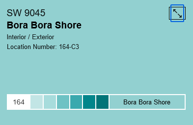
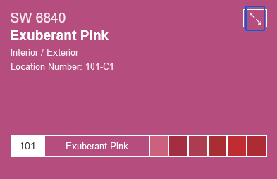
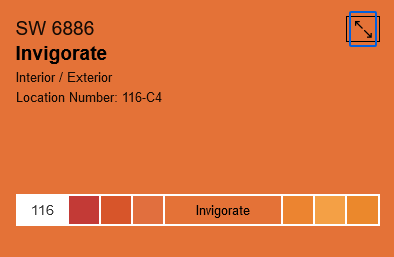
Rainbow Connection: Playful Kids Colors
Lively, energetic hues for kids according to Sherwin-Williams:
Share this:

Nuts and Bolts: Holiday Custom Request Design Change
Resulting Card:

Big holiday kudos to Jan for delighting the shopper and making them believe in “any card imaginable”. And to his speedy work in responding to this request and receiving the sale in less than 48 hours.
Share this:

Wanted New Cards: For Classmate
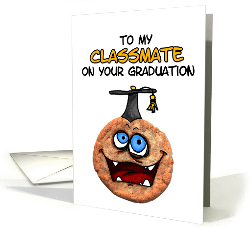
Note, if your designs are gender specific, be sure to fortify your meta-data accordingly.
We’d like you to create at least one card for these categories using the Stock Cards function (Bigstock) or your own graphic designs. Remember, when you’re submitting your new stock card, add a little note about the intended category in your Notes to Reviewers.
Be inventive, be clever, be creative. Go for it!
Share this:

Freebie Wednesday: Butter Scotch
Butter Scotch is a collection of handmade fonts designed to perfectly combine informal, presumptuous, romantic texts, cute bouncy scripts, natural brush fonts, and hand-drawn design elements. Font comes in OTF and TTF formats.
This stylish freebie is brought to you by I Do Not Sleep! Only available for at the Hungry Jpeg for a week!

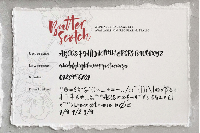


This product comes with a commercial license.
Share this:

Rainbow Connection: Year of the Tiger
2022 is the Year of the Tiger and here are some color palettes to celebrate that.
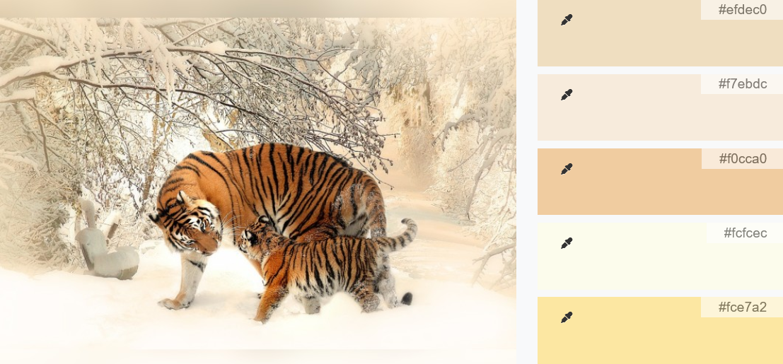
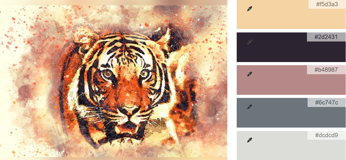
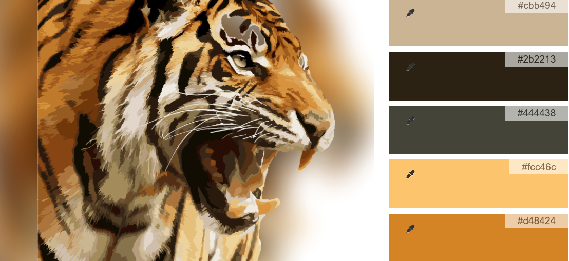
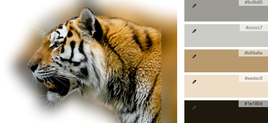
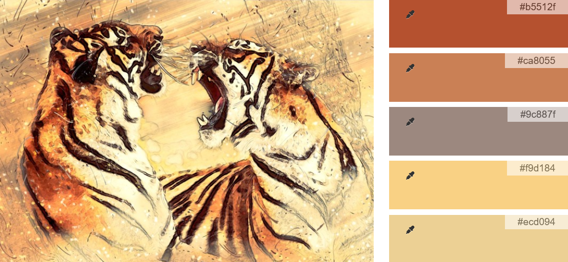
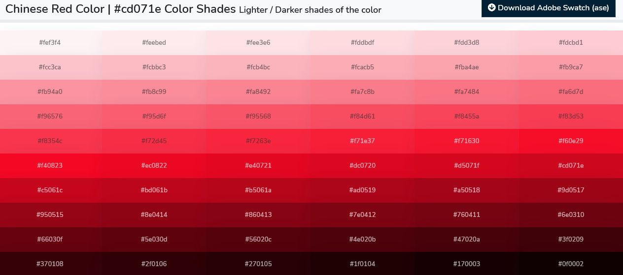
Red or vermilion, corresponding with fire, symbolizes good fortune and joy. Red is found everywhere during Chinese New Year and other holiday celebrations and family gatherings. In addition to the new year, red has been used in Chinese weddings since ancient times, which can represent the traditional Chinese wedding color.
Yellow of a golden hue, corresponding with earth, is considered the most beautiful and prestigious color. The Chinese saying Yellow generates Yin and Yang implies that yellow is the center of everything. Associated with but ranked above brown, yellow signifies neutrality and good luck. Yellow is sometimes paired with red in place of gold.
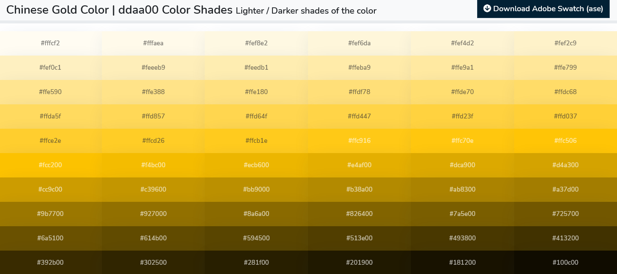
I hope this will give you some inspiration towards your card designs.
Share this:

Nuts and Bolts: Curved Text
Nuts & Bolts – Curved Text
As part of an overall design, greeting cards present an additional challenge / opportunity with text. The placement, color, size, font choice and more are just as important as the primary design and should not be an after-thought.
It should work and flow with the design giving a clear intention as to why this style was chosen. It should be done sparingly and with professional execution. We stress that this type of effect on text for professional greeting cards requires a learning curve that artists need to explore on their own.
We’d like to share some important considerations on a very difficult typography technique: Curved Text.
1. When in line with the design, curved text is allowable whereas warped text rarely is.
2. Slanted text simply never works – period.
3. Script fonts may only work out when they are not slanted.
4. Kerning adjustments are almost always required for minor adjustments, as is tilting the text a wee bit one direction or another after the Arc feature is applied.
5. See the Typography – Placement Submission Guideline with examples specifically:
Curved / Tilted / Slanted Text: It is very rare for curved, slanted, wavy or tilted text to work within a greeting card design. When it does, it does so because it’s following the lines and theme of the design. Still, this is a common mistake for the inexperienced greeting card designer to tilt the text in some way with no real connection to the image and no balance in the overall design.
6. Some prior advice from Corrie re: Front of Card Text specifically:
Do not warp, twist, bend, wave or otherwise mess around with your text. If you want to curve your text like I showed you in my second example card (the baby shower invitation), then you need to learn Adobe Illustrator. Text effects may look okay on a website banner, but you will not attract shoppers when you put that scrunched, higgledy-piggledy, warped and waved text on a greeting card. It doesn’t look professional. Don’t do it.
UPDATE to above: If you wish to create curves, twists, arcs, and bends to your text, then tools like Adobe Illustrator and/or Photoshop are necessary for your design arsenal – as are finding wonderful teaching videos online showing you how to use these tools to create professional quality curves on your card front text.
Now some examples:
BEFORE
The curved text is not meeting the marketability standards for professionalism as it does not follow the curve of the circle with enough precision. We would love to see this card back if you can edit the curved text. additional notes: the horizontal line alignment is not exact in this case but works with the design and the off center tail position. If the tail were perfectly centered then the text would need to also be perfectly aligned on each side.
AFTER
Additional considerations of what is NOT allowable:
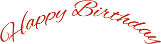
1. Using italic, forward leaning fonts, can look skewed and unprofessional especially when curved using the Warp Text ‘Arc’ feature in some software programs that causes greater distortion. This was created using the Warp tool Arc feature in Photoshop.
2. Curved text that does not precisely start and end on the same horizontal alignment, unless the rotation is purposefully different to work within the design.(This curve was created using the path tool in Photoshop)
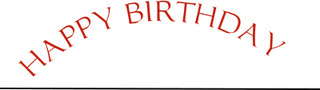
3. Odd spacing between letters can occur when you curve text in certain fonts, so the kerning will need further adjustment. Notice the ‘Birt’ spacing as compared with the balance of the letters.(This curve was created using the path tool in Photoshop)

Here are three wonderful examples of circular, curved, and wavy text that have been done with care, purpose, and all WORK:

The difference is made in the details!
Mindy
GCU Community Manager


